Best Cool White Paint Colors Benjamin Moore & Sherwin Williams
Cool crisp white is a refreshing neutral that can give any room a clean new look very quickly. Its the neutral backdrop for the room, like a white canvas is for a painting, waiting for all the beautiful pieces to be added to make the room beautiful. Cool white, also known as stark white for reasons we’ll see shortly, is currently trending as the go to neutral paint color for homeowners wanting a change from the gray walls they’ve had the past decade. You see in it new homes and condos that are being built. Also its a popular go to staging paint color recommendations for stagers. It neutral, looks amazing in homes on House Beautiful & Instagram, and is currently trending as one of the go to paint colors for designers, stagers, builders and renovators.
Crisp white can look amazing BUT they can also make a room look dingy like primer or gray in the wrong conditions. ALL whites are NOT created equal and white can actually be the trickiest color to decorate with.
Last year alone, I had 3 home owners come to after they had their main floors painted white. All 3 of them hated the look and felt the space look stark and cold. It feel stark and cold. Two clients were getting their house ready for sell, and in both cases their realtor choose cool white paint colors for their house making their house look cold and uninviting. Both clients came to me for help when their houses had been on the market for 4 months without a serious offer. The third person had her husband paint their apartment white from leftover paint that her husband had leftover from a job site. It was a big difference from what they had before, and initially she liked the crisp white look, but started to hate it when she saw the effects of the afternoon sunlight fading in the room leaving it feeling dingy and gray.
How to Pick the Best White Paint Color for Your House?
Style of your Home
What is the style of your home? Is it traditional and grand? Conventional? Contemporary & trendy? A starter home townhouse? Condo in a big city or a rambling beach front cottage/home? Whatever the style of your home is, the style will have an impact on how the color in your room presents.
Typically, cool crisp colors suit more modern architectural styles, whereas more traditional homes suit more warm colors. This is a general rule of thumb but its not set in stone.
Direction of the Room & Amount of Sunlight or Lack thereof
Have you enjoyed being in a room during a certain time of the day not felt comfortable during the evening for example? How much and what type of natural light a room gets can have a big effect on the undertones that come out of a color. What exposure your room faces, north, south, east or west, impacts the lighting in a room as does the time of day.
Colors will look totally different under artificial lighting like white or yellow incandescent light, or fluorescent light, but its easy to change artificial light in a room. Natural light, you need to work with it.
It’s good to know what direction your room faces when determining what color to go with in your room. Cool white paint colors are not best for north facing rooms where most of the true daylight starts to disappear from the room around mid-day. No matter how hard you try, its fighting an uphill battle and you’re better off choosing a warm white, or a cream, for a north facing room.
You don’t need to over analyze what your room’s exposure is, but move your color boards around all 4 walls and and different times of the day, typically 7 am, noon, and around 7 pm, to get a feel of how that color is going to look through all the lighting changes. Of all the 3 clients that came to me last year with their dreaded white walls, they had north or east facing rooms and picked a cool crisp white which made their room feel like it was painted in primer after the sun had gone down in the room. This is where testing is sooooo important for your room.
The challenge with the 3 clients that came to last year with disastrously white paint color choices was that they (or their realtor in two cases) chose the wrong type of white for the direction that their room faced. Two had north facing windows, while one had an east facing window. In all of the 3 cases they would have been better of with a warm white.
Evaluate the Undertones
What is an undertone?
Mass tone vs. undertone. Whenever a color is made by mixing two or more colors together, the “mixed” color will have both a mass tone and an undertone. The mass tone is what you see first; it’s what tells you the color is red, blue, green etc. This is what you see on your wall. The closer the undertone is to the mass tone, the truer the color will appear. So a true red will have a mass tone and the undertone is similar. Magenta will have a blue undertone, while poppy will have an orange undertone. If the undertone is different from the mass undertone, you will see a “tinge” of green, yellow or another color for example.
Believe it or not, unless its a “pure” white, whites will also have an undertone. They’re mixed with another color. Best way to decide if a “white” is too icy (a cool white) or too creamy (a warm white) is to place the large paint swatch up to a large white poster board. The undertone will be unearthed very quickly and you will be able to determine if its a warm white (red, yellow, or orange undertone) or a cool white (blue, green or purple undertones.)
Your Interior Design Style
One important factor to take into consideration when choosing a white is what do you like? What mood do you want to create in your room? Your home? Do you like cool & crisp white which is fresh & contempary? Or perhaps you like a warmer white that is still fresh but cozier.
Don’t know where to start? It can be a bit confusing. Get some ideas. Go on Pinterest or google and start looking at homes with similar styles to your house. Start gathering pictures or create a design board for your room on Pinterest or Canva. Just start. After you start collecting, you will get a feel for what you like and what you don’t like.
Read: What is an Interior Design Style + how do I pick one for my home?
Best cool white interior paints for your home
White Heron Benjamin Moore OC-57 & Extra White SW-7006

Benjamin Moore’s White Heron or its equivalent Sherwin Williams Extra White is a cool crisp white with blue undertones. BM White Heron and SW Extra White shows well on walls, trim and ceilings. It looks great in areas of lots of light and goes well with cool gray and cool finishes. Not the best choice to go with beige countertops and and with areas with warm finishes. There are better white color choices for warmer finishes.
As with all crisp whites, they are not great with north facing exposure rooms due to the lack of light.
Is this overwhelming picking the right shade of white?
Check out my online color consults here.
High Reflective White Sherwin Williams SW-7757
Sherwin Williams High Reflective White is pretty close to a pure white with a wee bit of warmth to it to prevent it from looking too stark. It will look amazing on your walls, trim and ceiling. Yup, that’s right. It one white that you can paint your entire room the same color and use it like a painter uses his/her canvas to create a stunning masterpiece.
Chantilly Lace Benjamin Moore OC-65

Chantilly Lace has become a very popular white for Benjamin Moore because its known as being a true white. That means it has no color added to it which makes it pure. The upside of this pure white is its great for ceilings, trim, and doors. The downside is, is that is could look too stark for walls, and kitchen cabinets. Some have used it for walls and like it while others find it too stark. You definitely want to test this one before using it on your walls. There are other choices that may be better for walls.
Decorator’s White Benjamin Moore OC-149
Decorator’s White is another favorite go to color in the Benjamin Moore family. Its a cool white with a gray undertone which makes it an off-white compared to a pure white. It can be used for walls and trim. It pairs well with gray paint if you’re looking for a white trim. Its a softer version of Chantilly Lace
Pure White Sherwin William SW-7005
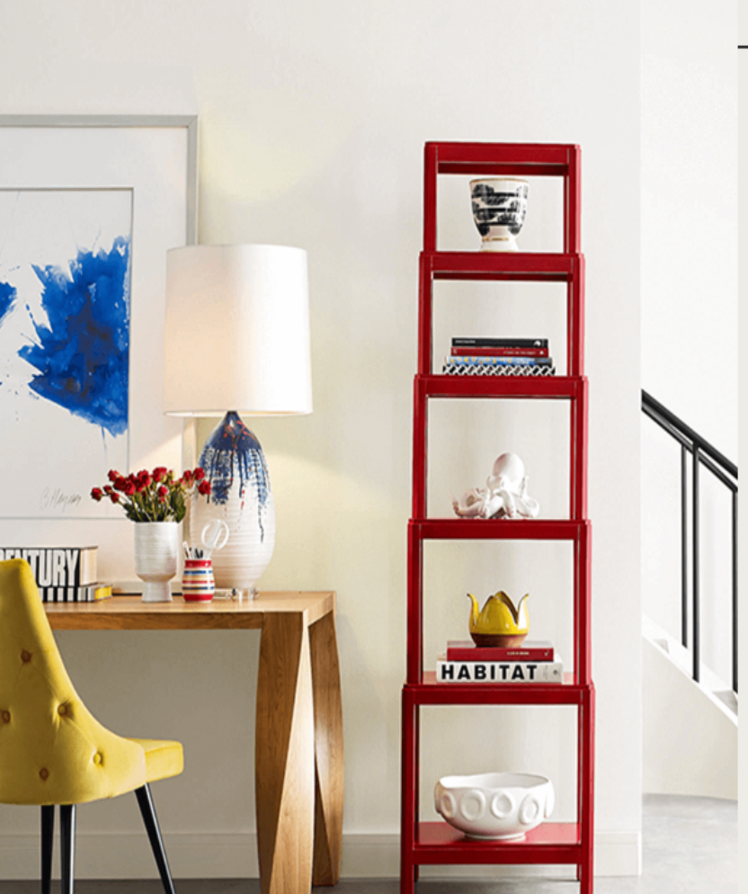
Photo: Sherwin Williams
Sherwin Williams’s Pure White is a popular white because its not a stark white meaning it looks great on walls but it has a BIT of warmth without looking creamy so it looks great on walls, trims and kitchen cabinets if you’re looking for white. It’s definitely one to put on the list to try out if you want a clean, fresh, modern white without it looking stark.
Test & Compare
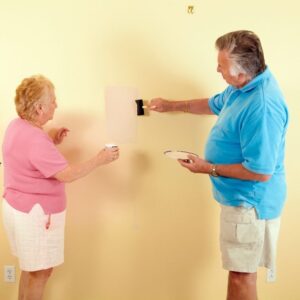
No doubt you’ve been to your local hardware store and seen a sea of paint color chips lining a big wall. It can actually be dauting but hopefully by now you have narrowed down your paint choices to include only a few colors. Comparing these colors side by side on different walls and at different times of the day is essential to picking the right paint color the first time.
The old method of buying samples pots of paint and painting various walls is an inefficient way of testing the best paint color for your home. A better option is to buy large cardboard paint samples that you can actually test on your walls at different times of the day to access what is the best color for your home.
Samplize is a company that sells large paint boards from the leading paint companies and comes in a wide range of colors.
These large paint boards can be placed with their sticky backing on various walls at different times of the day and in different rooms. It will give you a great way to see if the color works in your room or not.
Related How to Pick a Paint Color Posts:
Click here to check out & purchase samplize paint boards.
Read How do I pick a paint color for my house
Read how do pick a paint color when selling my house
FEELING OVERWHELMED?

Does picking out a white paint color overwhelm you? Or any paint color for that matter. I offer several different packages of picking out paint colors. I also guarantee my work. I will make sure you’re happy. Let me help you take the stress out of choosing a paint color for you.
Hi! I’m Debi Collinson. Designer. Color Consultant & Real Estate Investor.
I grew up learning how to read blue prints, going on construction sites and helping my dad, an Engineer|General Contractor|Co-Owner of a Design|Build|Engineering firm pick out paint colors for his buildings. Since 2006, I have been styling & staging hundreds of homes to make them look like they belong in a magazine page whether the client is styling to stay or staging to sell.
In my spare time, LOL, I buy “fixer uppers” to fix up & either sell for a healthy profit or to rent. I’m currently looking for my 10th “fixer upper.” Sign up to receive my e-mails of how to make your home stunning, how to sell your house for top dollar AND how to become financially independent one fixer upper at a time! Read my full story including my design credentials here.