How to choose a paint color to sell your house!
In one house I staged, the house had been on the market for 4 months NOT staged. There were over 50+ people that had gone through the home but it wouldn’t sell. The realtor called me in to stage the home. After I staged the home, the owner had complained about the furniture that I put into the home. It was the first complaint that I EVER had about the furniture. The SAME furniture that I had put into other homes. The issue WASN’T the furniture, however, the issue was the PAINTER had chosen the wrong color and it was difficult to make the house look warm & inviting. He picked a medium cooler steel gray because it was the trending gray at the time. But the kitchen cabinets were a warm honey oak and the floors were a warm but darker reddish oak. The color he choose clashed with the natural woods in the room. The wrong color choice was very evident in the bedrooms where the cool medium gray walls clashed with the warm 60’s beige carpet. The room felt “off” no matter how great the furniture looked in the room. The correct color would have been a cream, tan or a warm gray or a “greige” as we call warm grays.
Where Do You Start?
1. Choose Neutral Trend Paint Colors
The purpose of staging/getting your house ready to sell is that you’re appealing to the majority of the buyers. You’re appealing to 80 to 90% of the population. That means you need to make your house neutral, trendy and appealing to the masses IN YOUR NIEGHROHOOD so that they can picture themselves living in your home. If potential buyers feel the need to paint your house, they will either move on to another house that doesn’t need alot of work, OR they will just take the amount of money off in the offer that they feel will cost them in time, labor & materials.
The current color trends are definitely leaning towards the neutrals. whites, creams, tan, and light greiges. These colors give you a blank slate like a canvas in a painting. You create the mood of the room by the furnishings and décor that you choose just like a painter chooses the color and scene for his/her painting.
If you prefer the neutrals, you may want to take a clue as to which neutral, white, cream, tan, greige, gray from inspiration from your room.
The trend currently is moving towards less all neutral homes and dark & moody rooms. This is fine if you’re planning on living in your home, but if you’re getting it ready to sell, this may or may not work depending on your location, and the demographic of your neighborhood.
Read: 2024 Best Paint Colors to Sell Your House
Read 2024 Paint Color & Design Trends to Sell Your House
Just because a staging paint color is trending in your area doesn’t mean that its the right color for YOUR walls.
Do you find choosing a neutral paint color overwhelming? Sign up to my 6 part e-mail series where every day for 5 days I will explain a different neutral and give you my top neutral recommendations.

2. Take into consideration the room’s elements like kitchen cabinets, flooring etc.
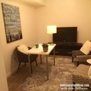
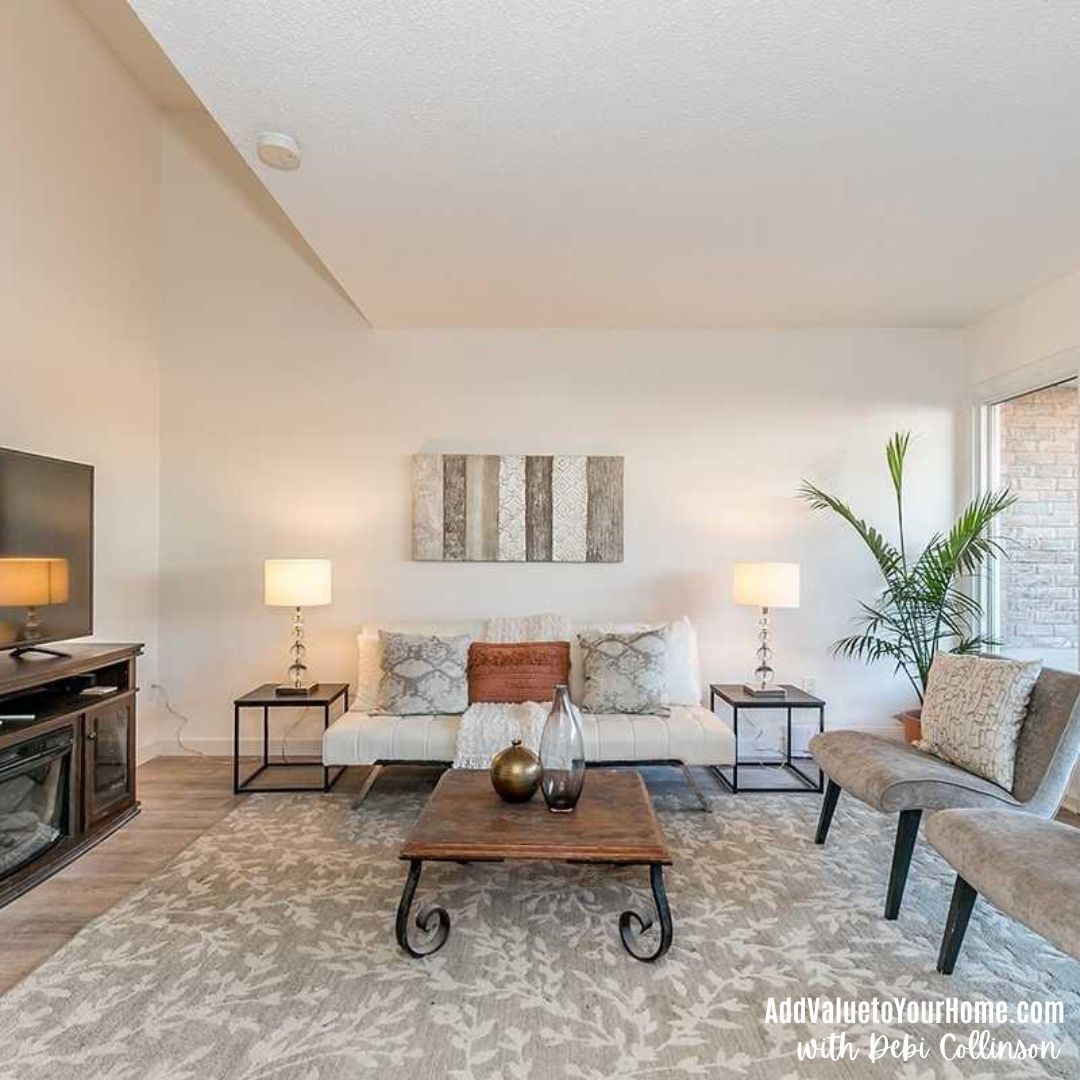
Recently I was brought in to help two different clients who’s realtor had picked a “white” paint color for their main floor since in alot of areas, white is the trending paint color for staging a house right now. But white it white right? How hard is it to pick white?
Never let your Painter (or your Realtor) pick your paint color!
Soft creams & whites are now becoming the trend in staging paint colors. It can be trickier to stage with these colors because you need to rely on your accessories and other features in your home to make a room look stunning. If not done effectively, rooms can look stark, cold, and uninviting.
I was asked to re-stage two houses because their realtors recommended a stark white for the walls throughout the main floor and asked the clients to remove all their pictures off the walls. The result in both cases? The houses looked stark, cold, and uninviting. And in both cases, I have been brought into transform their spaces to become warm & inviting.
Well meaning painters and realtors don’t necessarily know what the correct paint color is for your house. There is alot to take into consideration to make your Know what the trending “neutrals” are in your neighborhood. Grays are more popular in some areas, whereas white and cream is more popular in other areas. You need to know the trend in your neighborhood before you paint. Are you in an older suburb? Trendy condo or townhouse? Or a relatively new build? That’s why it’s important to go to open houses in your neighborhood so you will know the trends.
Read Why You Need to go to Open Houses in your Neighborhood!
3. Watch Out for the Undertones!
When choosing the right color for your home, the undertones matter because if the undertone is wrong, the room just feels off!
Mass tone vs. undertone. Whenever a color is made by mixing two or more colors together, the “mixed” color will have both a mass tone and an undertone. The mass tone is what you see first; it’s what tells you the color is red, blue, green etc. The closer the undertone is to the mass tone, the truer the color will appear. So a true red will have a mass tone and the undertone is similar. Magenta will have a blue undertone, while poppy will have an orange undertone.
So what happened with my client in the example above? The undertones of the elements of the room, specifically the oak kitchen cabinets and the cherry hardwood floors were warm, while the undertones of the wall color were cool. They clashed! The cool steel gray walls were too harsh for the warm wood elements in the room. Not to mention the 80s beige carpeting in the bedrooms as well!
Warm vs. Cool
How do you tell if a color is warm or cool? Warm colors create a cozy, warm vibe whereas cool colors are crisp and vibrant. Neither one is right or wrong. It just depends on the mood that you are wanting to create in your room.
Warm colors typically have a yellow, orange or red (pink) undertone.
Cool colors typically have green, blue or a purple undertone.
It may seem easy to pick a neutral like a white or a cream, but there are undertones that can warm and cool tones that can complement or conflict with your elements. You have no doubt heard about the movie 50 shades of gray. BUT did you know that those 50 shades of gray are different because of their undertones? How much sun the room gets depending on which direction the windows face? How much daylight the room gets? What kind of artificial lights are in the room?
Can you mix warm & cool colors? It depends who you talk to. Some color experts feel you can tone down a warm room by adding a cool color and warm up a cool room by adding a warm color. Others say you should never mix warm and cool colors together. Its possible but the choice needs to be intentional. In my client’s case, the warm elements of the room where overpowered by the cool steel gray paint color.
4. You Need to Consider the light in a room – both natural and artificial light
Have you enjoyed being in a room during a certain time of the day but not felt comfortable during the evening for example? How much and what type of natural light a room gets can have a big effect on the undertones that come out of a color. What exposure your room faces, north, south, east or west, impacts the lighting in a room as does the time of day. You don’t need to over analyze what your room’s exposure is, but if you’re testing color boards, be sure to move them around all 4 walls and and different times of the day, typically 7 am, noon, and around 7 pm, to get a feel of how that color is going to look through all the lighting changes.
Colors will look totally different under artificial lighting like white or yellow incandescent light, or fluorescent light, but its easy to change artificial light in a room. Natural light, you need to work with it.
5. How to test paint colors!
Now that you have some ideas on where to start for your colors, the next step is to get large paint color samples also known as paint boards and start comparing. You can order them through the paint companies website or a company called Samplize. They’re peel and stick so they’re easy to move around.

Don’t put them against the old paint color. You will be able to see how they differ. This difference is the undertones. If you’re looking at light colors or neutrals, look down the strip to reveal the undertone. You should be able to see the mid to darker colors like blue, green, yellow, pink for example. By doing this, you may find that the tan has too much pink it in or that the white that you thought was going to be THE color is too green.
Hopefully you have narrowed down your color choices to a few by now. Buy WHITE poster boards from the dollar store. Paint your color boards with your test pot paints and place them on the wall UNDER white poster board paper. NEVER put the test paints directly against your current color. You will not get a good test of what that paint actually looks like. NEVER EVER paint the sample paint directly on the wall. You will not get a true feel for the color. Be sure to move the poster boards around on ALL four walls of the room and a different times of the day.
It’s never too soon to start picking a staging paint color

Need some helping picking the right color for your home?
You may think its premature to start picking paint colors when you’re still decluttering and getting rooms ready, but it takes time to decide what color you want, pick a painter, and book the painter in the time frame you need!!! Good painters at reasonable rates are booked weeks in advance! The sooner you get your paint color chosen and the painter booked, the better!
Check out my Paint to Sell package here!
Two houses that I staged recently had the WRONG paint color chosen by their realtors in each case. The stark white paint color made each house look cold and uninviting. Both houses sat on the market unsold for 4 months before I was frantically called in to help.
I help busy homeowners, just like you, to style their house to make it a stunning retreat, where they can live and enjoy their home. I help homeowners, make money beyond their wildest expectations from the sale of their house by guiding them when they’re getting their house ready to sell.
Hi! I’m Debi Collinson. Designer. Color Consultant & Real Estate Investor.
Hi! I’m Debi. I conducted my first color consult at the age of 7, lol, for my dad, Co-Owner | General Contractor | Structural Engineer, for one of his Design | Build projects.
I’m an Interior Designer, a Double-Certified Paint Color Expert, with advanced training in kitchens + bathrooms!
Since 2006, I have helped hundreds of homeowners, just like you, design + style their home to make it look like it belongs in a magazine page. I moved my business online in 2020.
My secret weapon is I’m a real estate investor & “house flipper.” What this means to you is that I’m always recommending designs, colors, furnishings & accessories that will add value to your home in addition to making your home stunning! Bonus!