The Best White Paint Trim Colors
A very common question people ask me when they’re painting their interiors, is what color should I paint my trim? If I have white walls, can I paint my trim the same color? What about my doors, and windows? What color should I paint those? What sheen should I use for the paint color? Can I paint my ceiling the same color as my trim? Lots of questions about white paint and I have lots of answers for you!
What you NEED to know about white paint!!!
There’s four things you need to know about white paint before we dive into the best white trim colors. This is essential in picking the right paint color for your home, your home’ style and your room’s features & elements.
1. White is the most reflective paint color!
So what does this mean exactly? It means that white will reflect the colors that are surrounding it and it will reflect on the walls. So if you have a living room with white walls, and green trees right outside the window, the green from the trees can be reflected back on the walls and make a portion of your wall green. If you have bold colored furniture like a bright blue couch, that bright blue color may reflect on your walls as well. And you may not want this look!! As always, you need to test, test, test your paint color!
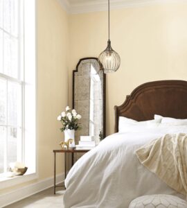
2. White walls are going to look different in each room at different times of the day, and depending on which direction the room is facing.
You have probably heard that depending on the direction that your room faces, and the time of the day, this will have an impact on how the SAME white paint color will look being exposed to the north, south, west or east. Northern exposure is the trickiest as the wall
White walls are going to look different in each room at different times of the day, and depending on which direction the room is facing.
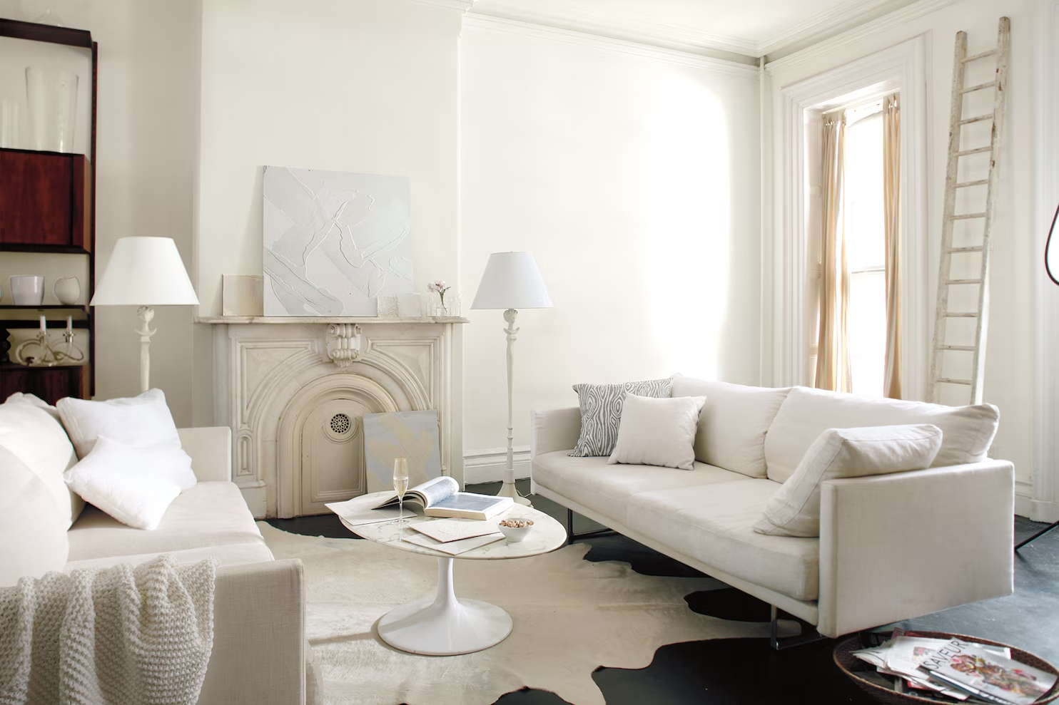
In the pictures above, all these rooms were painted with the SAME white paint, Behr Palais White which is VERY similar to Benjamin Moore White Dove. They were all taken within 30 minutes of each other on the SAME day. So why the difference? The lighting and the direction that the room faces of course. And they’re going to look different in the morning, afternoon, and when the sun goes down.
Read: Should I Paint my walls white? Read this first!
3. All paint colors, including whites, have undertones.
What the heck is an undertone?
Mass tone vs. undertone. Whenever a color is made by mixing two or more colors together, the “mixed” color will have a mass tone and an undertone. The mass tone is what you see first; it’s what we call the color, red, blue, green etc. and its what we see on the wall. The closer the undertone is to the mass tone, the truer the color will appear. So a true red will have a mass tone and the undertone is similar. Magenta will have a blue undertone, while poppy will have an orange undertone. If the undertone is different from the mass undertone, you will see a “tinge” of green, yellow or another color for example.
4. Whites are either “warm” or “cool.”
Believe it or not, unless its a “pure” white, whites will also have an undertone. They’re mixed with another color. Best way to decide if a “white” is too icy (a cool white) or too creamy (a warm white) is to place the large paint swatch up to a large white poster board. The undertone will show very quickly and you will be able to determine if its a warm white (red, yellow, or orange undertone) or a cool white (blue, green or purple undertones.)
Warm whites have warm undertones of pink, red, orange and yellow. They look soft, warm and relaxed. Warm white rooms are cozy and inviting. Warm whites are suitable for rooms where you may have less lighting and experience cold gray weather in the winter. Warm whites are more forgiving and easier to choose than a cool white. You can find warm whites in almost all type of design styles with perhaps the exception of an ultra modern home where you typically find cool whites.
Cool whites have cool undertones of blue, green and gray undertones. You see cool white paint colors being used on walls that get alot of natural light throughout the year. Cool crisp whites are a refreshing neutral that can give any room a clean new look very quickly. Its the neutral backdrop for the room, like a white canvas is for a painting, waiting for all the beautiful pieces to be added to make the room beautiful. Cool white is the leading white color choice for modern, contemporary spaces but choosing the wrong cool white for walls can look like primer.
Best Cool White Paint Colors for Trim & Doors
Benjamin Moore Chantilly Lace OC-65
Chantilly Lace has become a very popular white for Benjamin Moore because its known as being a true white. That means it has no color added to it which makes it pure. Its a great cool crisp white for ceilings, trim, and doors. If you’re looking for a cool crisp finish to your doors & trim, this is the color for you!
The downside is, is that is could look too stark for walls, and kitchen cabinets. Some have used it for walls and like it while others find it too stark. I used it in one of my Air BnB’s and two years later I ended up repainting it because it just felt too stark for the walls. It just wasn’t the vibe I was going for in my waterfront cozy beach house. However lots of homeowners love Chantilly Lace for their walls and it looks great as you can see in the picture above. You will find Chantilly Lace more suited for contemporary homes. Its a great trim & door color. You definitely want to test this one before using it on your walls. The Sherwin Williams similar to Chantilly Lace is High Reflective White SW-7757
Sherwin Williams High Reflective White SW-7757
Sherwin Williams High Reflective White is considered to be their truest, brightest, cleanest white. The Benjamin Moore “equivalent” is Chantilly Lace. It is a cool white with a slight blue undertone. Its a clean crisp contemporary white. The downside it can look stark, just like Chantilly Lace, when used in the wrong space and without proper styling. The upside is, is can look amazing in a contemporary room with stylish, trendy furniture. You can paint the entire room, walls, ceiling, trim & door the same color, using eggshell for the walls, and satin for the doors, trim & ceiling.
Benjamin Moore Oxford White CC-30 aka White Heron OC-57
Oxford White | Heron White is a cool bright off-white that leans towards gray. It’s a popular choice for both walls and trim color in kitchens, living rooms and bedrooms. Barely-there cool undertones make this a consistently white paint color, even in a sunny room.
Benjamin Moore Decorator’s White OC-149
Decorator’s White is another favorite go to color in the Benjamin Moore family. Its a cool white with a gray undertone which makes it an off-white compared to a pure white. It can be used for walls as well as your trim and doors. If you’re painting your walls with gray paint or a moody paint color like blacks, gray and cool greens that are so popular right now, this would be an excellent choice for your trim & door color. Its a softer version of Chantilly Lace. I would NOT pair Decorator’s white if you’re using a warm paint color for the walls. There are better choices.
Sherwin Williams Extra White SW-7006
Sherwin Williams Extra White SW7006 is a very popular clean white because its so versatile. Its a cool white with a slightly blue undertone and you can use it for trim, doors and the ceiling. Because of the slightly blue undertone, you would want to pair this one with a cool paint color like blues, greens or grays on your walls as opposed to a warm color.
If you want a whole house cool white, Extra White could be the white for you. In those hard to pick north facing rooms, it will appear cooler, could possibly look stark on a cloudy dull day. In south facing rooms, especially in the afternoon sun, it can look warm as any white paint color can, but it won’t look creamy because it doesn’t have yellow undertones.
Best Warm White Paint Colors for Trim & Doors
Benjamin Moore White Dove OC-17
Benjamin Moore White Dove is another popular white in the Benjamin Moore family and its actually one of my favorites. Its a warm white without being yellow, and great for those tricky north facing rooms. It would also be suitable to paint your trim with White Dove but using a different sheen than the walls for differentiation. This color is considered to be similar to Sherwin Williams Alabaster.
Sherwin Williams Alabaster SW 7008
Sherwin Williams Alabaster SW 7008 is one of Sherwin Williams most popular warm whites and was named Color of the Year 2016. This paint color is one of Joanna Gaine’s favorite paint color and its easy to see why. Its a warm white with a slight yellow undertone. Its great for those north facing rooms and its great as a whole house paint color. You can paint your whole house on the walls using this color and the trim, doors & ceiling in a different sheen. Its also a great color if you’re looking for a white for trim, doors & ceiling and your walls are a totally different color. This color is considered to be similar to Benjamin Moore’s White Dove.
Benjamin Moore Simply White OC-117
Benjamin Moore’s Simply White OC-117 is a warm classic popular white and it was their color of the year in 2016. It’s a warm white, LRV of 91.7 with yellow undertones. If your room receives an abundant amount of natural light, you won’t notice the yellow at all. This color can be used as a whole house paint color and paint your trim, doors & ceiling in a different sheen (see below.)
Sherwin Williams Pure White SW7005
Don’t let the name fool you on this one. Sherwin Williams is a soft pure white with warm yellow undertones but doesn’t look creamy. Its a very versatile white, it doesn’t look start like some of the cool whites can in the wrong conditions, and it can be used a whole house paint color for both those pesky north facing rooms and look lovely in a south facing room.
Why I would NOT use BM Cloud White for trim.
Don’t get me wrong. I LOVE BM Cloud White. Cloud White has an LRV of 87.4 putting it in the white category. Its a warm white paint and one of Benjamin Moore’s most popular paint. Its creamier and has yellow undertones. Ahhhh…. its the yellow undertones that may make it too creamy for a trim & door color.
If you’re using Cloud White for your walls, I would definitely use Cloud White for the trim in a satin finish. Would you use Cloud White for a trim with another white paint color for walls? Probably not! There would be better choices I would use as we have mentioned above. Some designers recommend Cloud White for trim. If you’re so inclined, test, test, test it before you use it. Test it at all times of the day and in various light exposures of your room(s).
Why I would NOT use Sherwin Williams Snowbound for trim.
Sherwin Williams Snowbound is another lovely and popular white just like BM Moore’s Cloud White. But like Cloud White, Snowbound ‘s undertones that may be its downfall for most. Snowbound has pink undertones, and may be too “pinky” for most. And there’s nothing wrong with pink undertones depending on where you use it, but you may not want it for your trim color. If you’re using Snowbound for your wall color, then definitely use Snowbound for your trim in a satin sheen.
Just like some designers recommend Benjamin Moore’s Cloud White for trim, some designers recommend Snowbound for trim. Others say to avoid it, including me. If you’re determined to use Snowbound for your trim, test, test, test first before you use it.
What paint sheen should I use for trim?
A satin sheen is very popular and trending today for trim, cabinetry, and doors. Satin sheen looks contemporary, and gives just enough of a shine without looking too shiny.
A semi-gloss sheen is also a popular choice for doors & trim. It has a bit more shine than satin and is more durable and easier to clean. It works well for high traffic areas like mud rooms or kids rooms. Having said that, if you are using a satin sheen for your whole house, but want to switch to a semi-gloss for a mud room or a kids room, you want to make sure that the switch is not obvious. For example, if the mud room is an extension of the family room, it would be an obvious switch from one sheen to another. However if the mud room is a separate space at the back of the house and is primarily the kids’ entrance, then switching from one sheen to another would not be as visible. As always, test, test, test your look before going all in.
High gloss is out of style for residential use in trims & doors and it will date your house. Avoid it at all costs!
What paint sheen should I use for walls?
Flat paint has the lowest luster and also the ability to hide the bumps and scratches the most. Flat is good for ceilings because it has a non-reflective finish and you won’t get the glare of lights and other items that want to reflect that we talked about earlier. It’s best for low-traffic rooms that have a ton of light like offices and more formal rooms, like dining rooms but you may want to use eggshell or satin if you’re painting your whole house the same color as you will want consistency in the finish as well as the paint color.
Eggshell paint has a bit more luster than a flat finish. It cleans easier, covers better, wears better, and lasts longer than flat paint. You can clean scuffs and marks on the wall easily with a warm, damp cloth. The finish lasts many years longer than flat. Eggshell looks great for white walls.
Satin paint has a beautiful subtle sheen. Its very durable and scuffs and marks can be wiped off with regular cleaning. Satin reflects light and will show more imperfections than flat or eggshell. Satin is suitable for bathroom walls. Would not use it in regular rooms.
Should I paint my white walls and trim the same color?
Yes! Typically speaking, its best to match your trim color and wall color. It gives a nice cohesive look. Use a flat sheen for the walls and ceilings, and a satin (or semi-gloss for high traffic areas – see above) for your trim and doors. The difference in paint sheen will create a nice visual separation between the walls and trim, and help them stand apart from each other, even though they are the same color.
BUT! And there’s always a but, in some situations you may want to mix your cool & warm whites. You may want a differentiation in your space. For example, if you have an open concept kitchen & family room, you may want your walls to be a warm white and your kitchen cabinets to be a cool white.
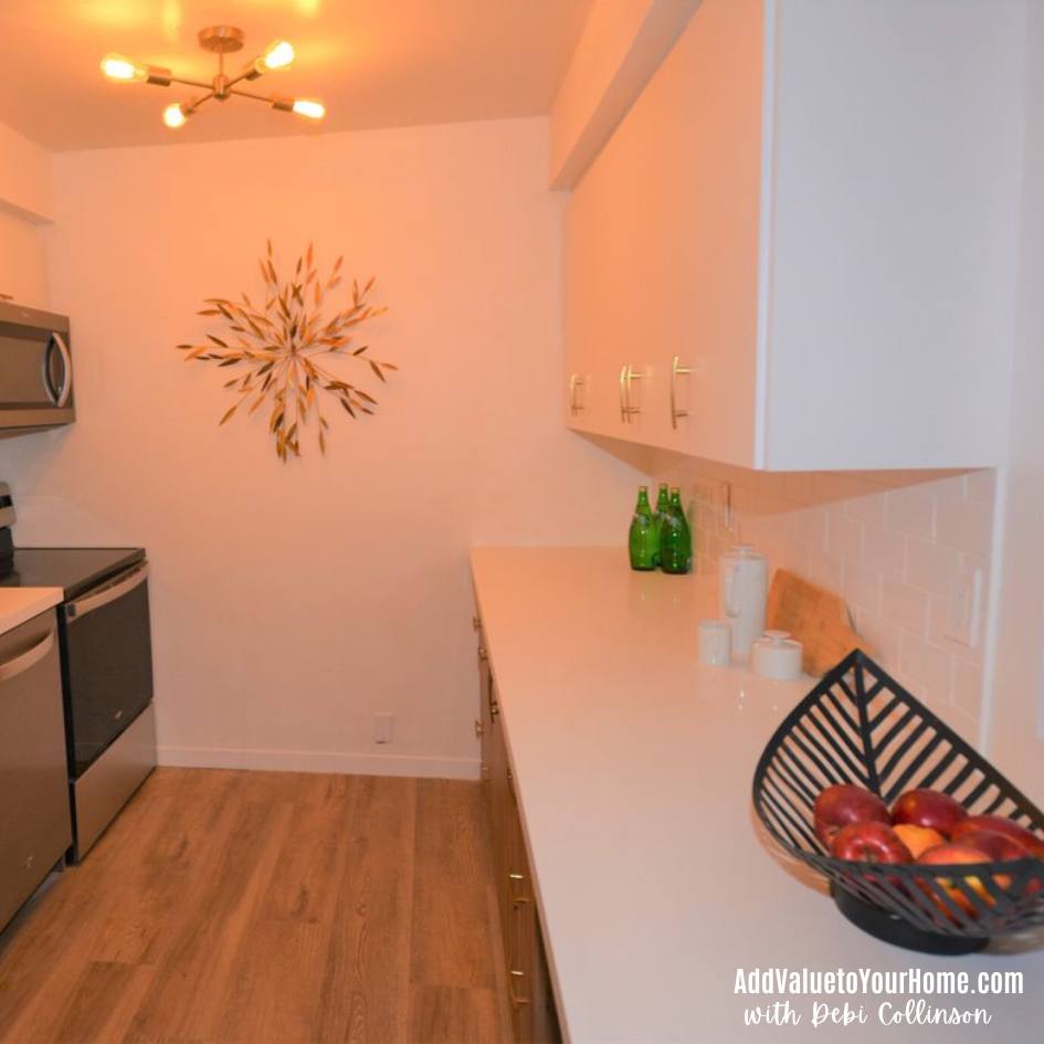
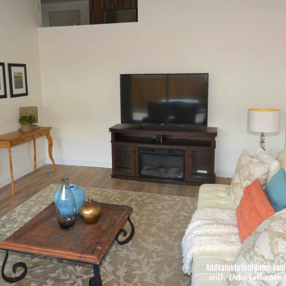
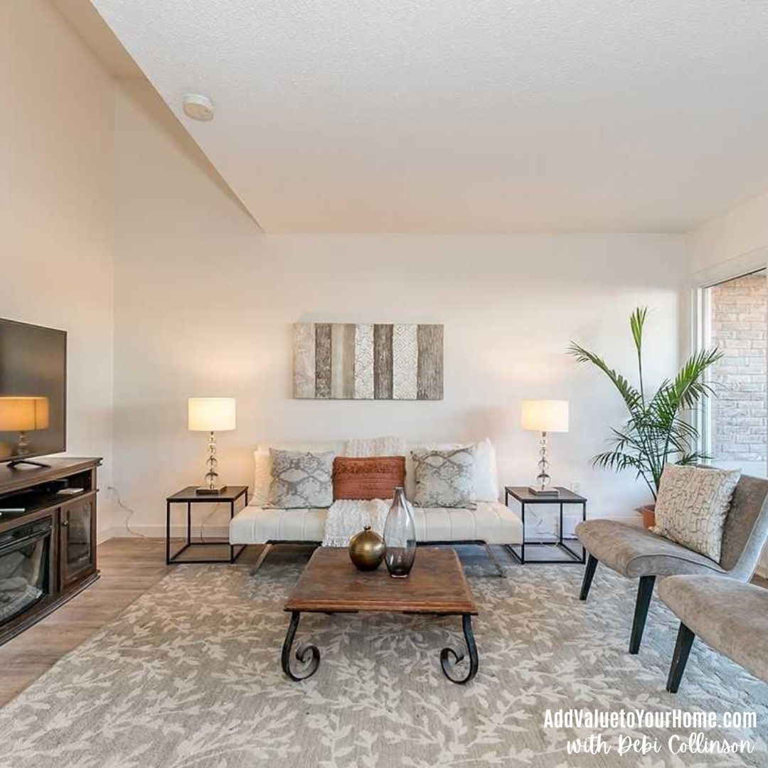
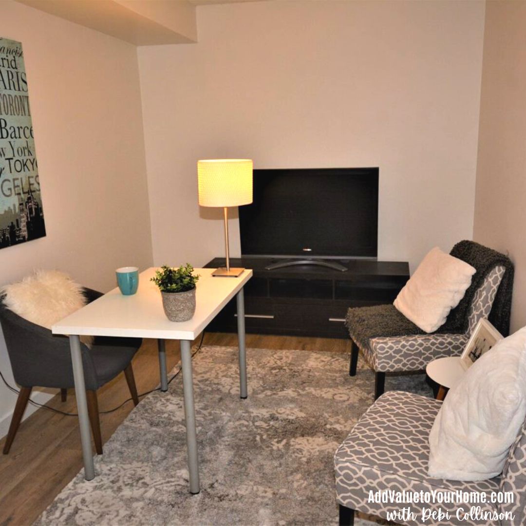
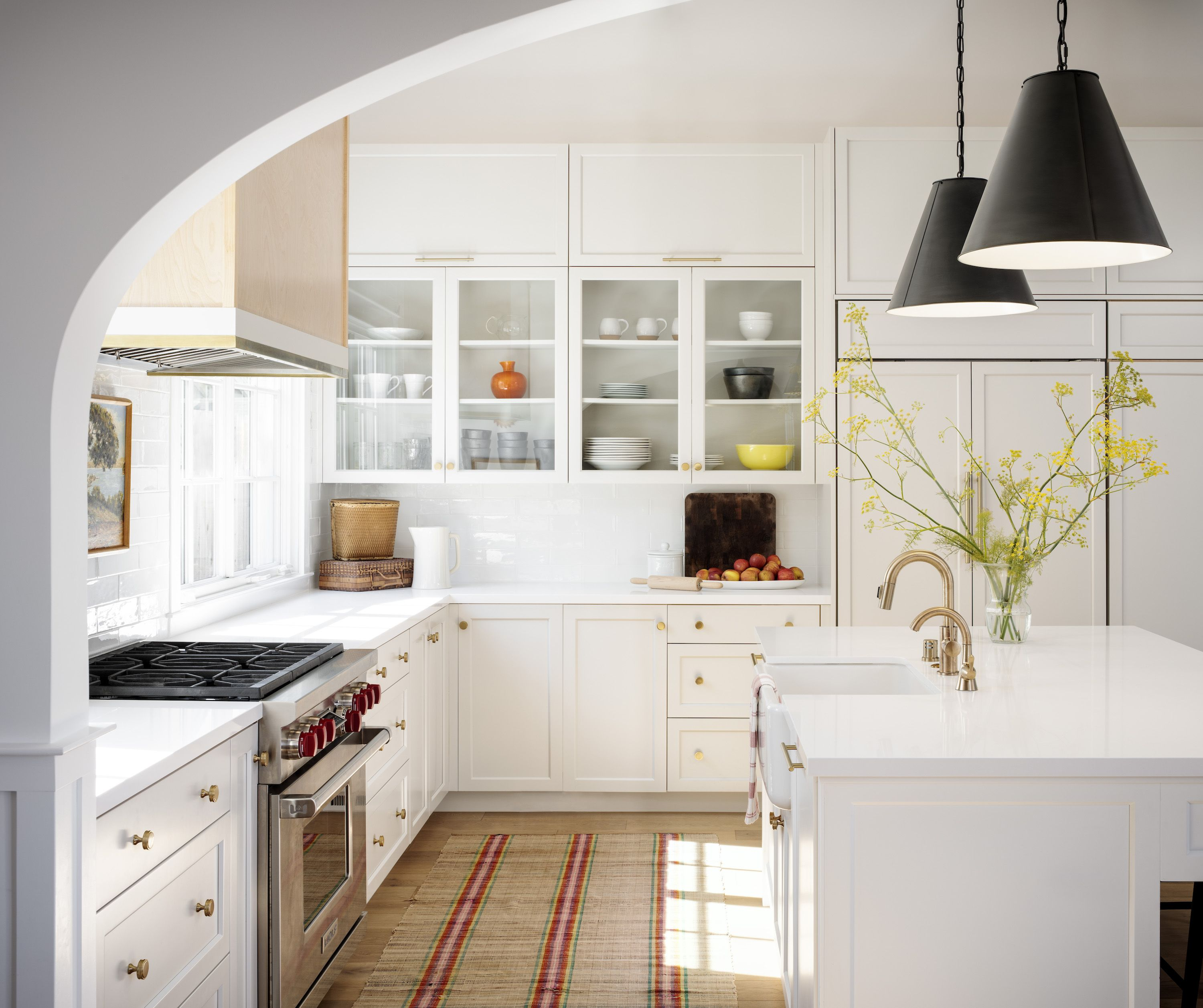
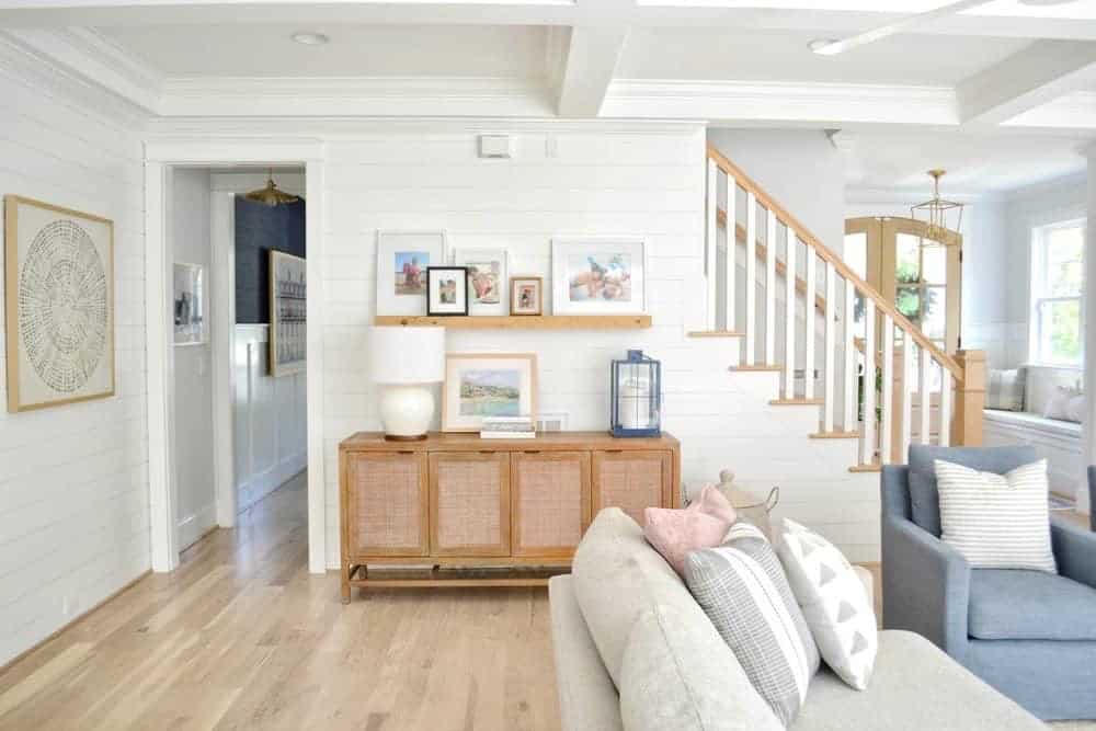
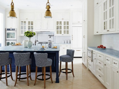
In my kitchen renovation above, I used Benjamin Moore White Dove for the walls, and a true cool white for the kitchen cabinets. One level below, the living room painted was painted in Benjamin Moore White Dove also with a cool white for the trim. I used a combination of cool whites & warm whites for accessories in both spaces to tie the look together. Notice the difference in the wall color between the two spaces. The kitchen is on a higher level with no outside windows, whereas the living room has an entire wall of windows on the north side of the room.
Why did I paint my wall color and my trim color a different white?

For my townhouse, I was getting it ready to sell and wanted the same paint color throughout the place for a cohesive look throughout. Since the townhouse faced BOTH north and south facing windows, I use a whole house paint color, Benjamin Moore White Dove as it would be able to handle all the complexities of different facing directions, different looks throughout the day. My decorating style was warm and contemporary at the same time, so I used furniture, accessories, curtains, bedding etc with both warm & cool white and beige tones throughout the house to create a warm contemporary look
Should I paint my ceilings the same color as my trim?
Yes! Painting your ceiling, doors & trim all the same color will give your space a very cohesive look. Use a flat sheen for your ceiling and satin for your trim & doors (see above.)

Feeling Overwhelmed?
Does picking out a white paint color overwhelm you? Or any paint color for that matter. I offer several different packages of picking out paint colors. I also guarantee my work. I will make sure you’re happy. Let me help you take the stress out of choosing a paint color for you.
Click here to learn more about my online e-design & staging & color consults.
Hi! I’m Debi Collinson. Designer. Color Consultant & Real Estate Investor.
I grew up learning how to read blue prints, going on construction sites and helping my dad, an Engineer|General Contractor|Co-Owner of a Design|Build|Engineering firm pick out paint colors for his buildings. Since 2006, I have been styling & staging hundreds of homes to make them look like they belong in a magazine page whether the client is styling to stay or staging to sell.
In my spare time, LOL, I buy “fixer uppers” to fix up & either sell for a healthy profit or to rent. I’m currently looking for my 10th “fixer upper.” Sign up to receive my e-mails of how to make your home stunning, how to sell your house for top dollar AND how to become financially independent one fixer upper at a time! Read my full story including my design credentials here.