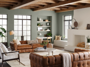
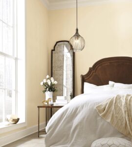
8 Tips to choosing the right paint color for your house!
One woman I know, had her husband paint their living room 3 times in a row because she hated the paint color she picked. She hated the third color that was just painted on the wall. Her husband shrugged his shoulders and said from now on, you’re on your own if you change your mind AGAIN. She was fine with that but I’m surprised that she got her husband to paint the room three times. lol There are easier ways to determine the perfect paint color for your home rather than painting the room again and again until you get it right.
Picking the right paint color for your house is a daunting job. There are so many paint color choices to consider, and often you don’t know where to start. These 7 tips on picking the perfect paint color for your room will help you avoid the pain of having to paint a room twice.
How do I pick the right paint color for my house?
1. Style of your Home
Just because a paint color is currently trending doesn’t mean its the right color for YOUR home. I often see homeowners take the trending color and paint their walls but hate it once its on the wall.
What is the style of your home? Is it traditional and grand? Conventional? Contemporary & trendy? A starter home townhouse? Condo in a big city or a rambling beach front cottage/home? The style of your home will have an impact on how the color in your room looks.
Trends in colors come and go. We were in a gray color phase forever. Then we got bored of gray during the pandemic. We switched to all white homes, got bored again. Now we’re into brave & bold colors. But that is starting to change as we embrace the lighter & warmer colors.
Just because a color is trending, doesn’t mean its the right color for YOUR home.
Typically, cool crisp colors suit more modern architectural styles, whereas more traditional homes suit more warm colors. This is a general rule of thumb but its not set in stone.
Confused? Don’t know where to start? Get some ideas. Go on Pinterest or google and start looking at homes with similar styles to your house. Start gathering pictures or create a design board for your room on Pinterest or Canva. Just start. After you start collecting, you will get a feel for what you like and what you don’t like.
Figuring out what color you don’t like for a room is just as important as figuring out what color you do like in a room.
Read Create a design board when designing a room
2. Your color inspiration
When you’re designing a room, the best way is to start with an inspiration piece. Your color inspiration can be artwork, , an accent wall or an expensive rug from your travels. If your house has a stunning view like a ravine or water, this could be your inspiration piece. Try to avoid using items that maybe easily replaced one day like cheap furniture or throw cushions. Your inspiration piece should be around for the long haul.
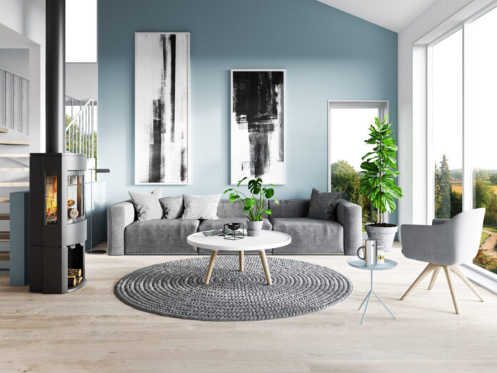
What kind of mood to you want for your room? Refreshing and crisp? Try a cool crisp white. Calming, relaxing and neutral? Try a soft white, cream or light beige and tan.
Do you want something moody? Try a bolder color.
If you want to try a color and you’re not sure where to start, experiment in a powder room, or an accent wall to start. Pondering between a color and a netural? Pursue both options until you narrow it down.
3. The direction of your house & exposure to sunlight impacts the color of your walls
You need to consider the natural light AND the artificial light in a room when choosing your room color.
Have you enjoyed being in a room during the day but felt uncomfortable in the room in the evening? How much and what type of natural light a room gets can have a big effect on the undertones that come out of a color. What exposure your room faces, north, south, east or west, impacts the lighting in a room.
Colors will look totally different under artificial lighting like white or yellow incandescent light, or fluorescent light, but its easy to change artificial light in a room. Natural light, you need to work with it.
Of all the 3 clients that came to me last year with their dreaded white walls, they had north or east facing rooms and picked a cool crisp white which made their room feel like it was painted in primer after the sun had gone down in the room. This is why testing is sooooo important for your room.
It’s good to know what direction your room faces when determining what color to go with. You don’t need to over analyze what your room’s exposure is. But you do need to know if you like what the color is going to look like at various times of the day. We spend more time in some rooms than others in the day time, so it may not matter how the room appears at night. However, rooms like our primary bedroom where we spend the majority of time in our room at night, it definitely matters how the paint color makes us feel at night time.
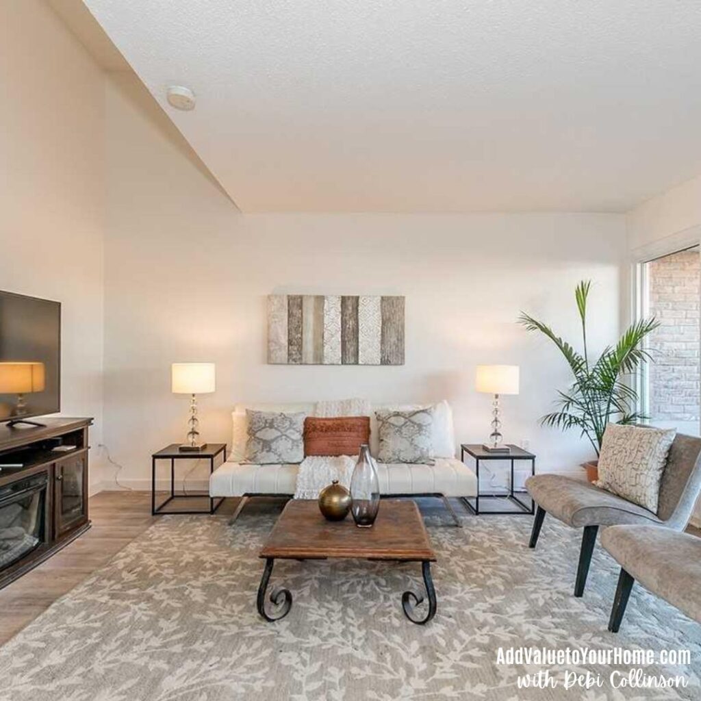
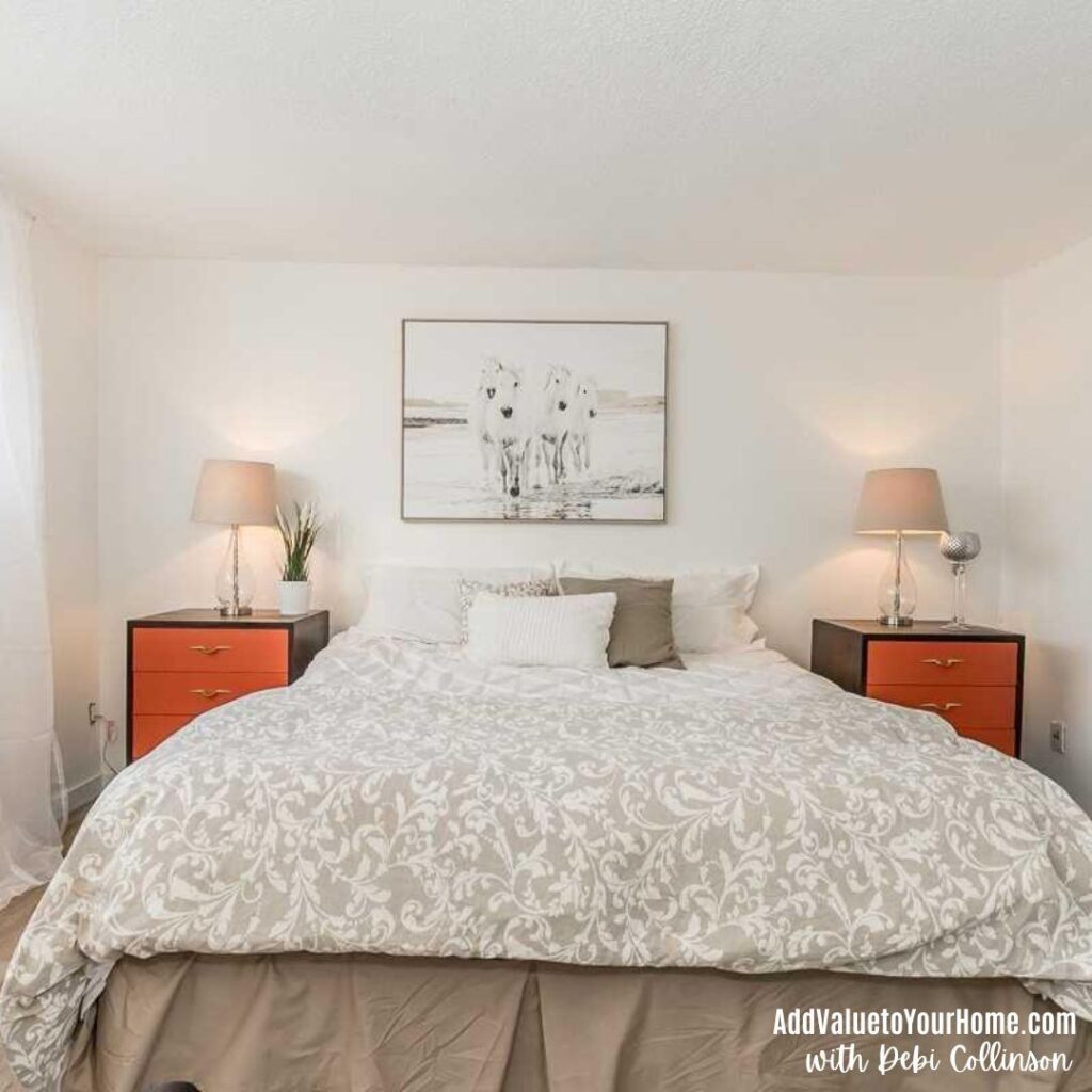
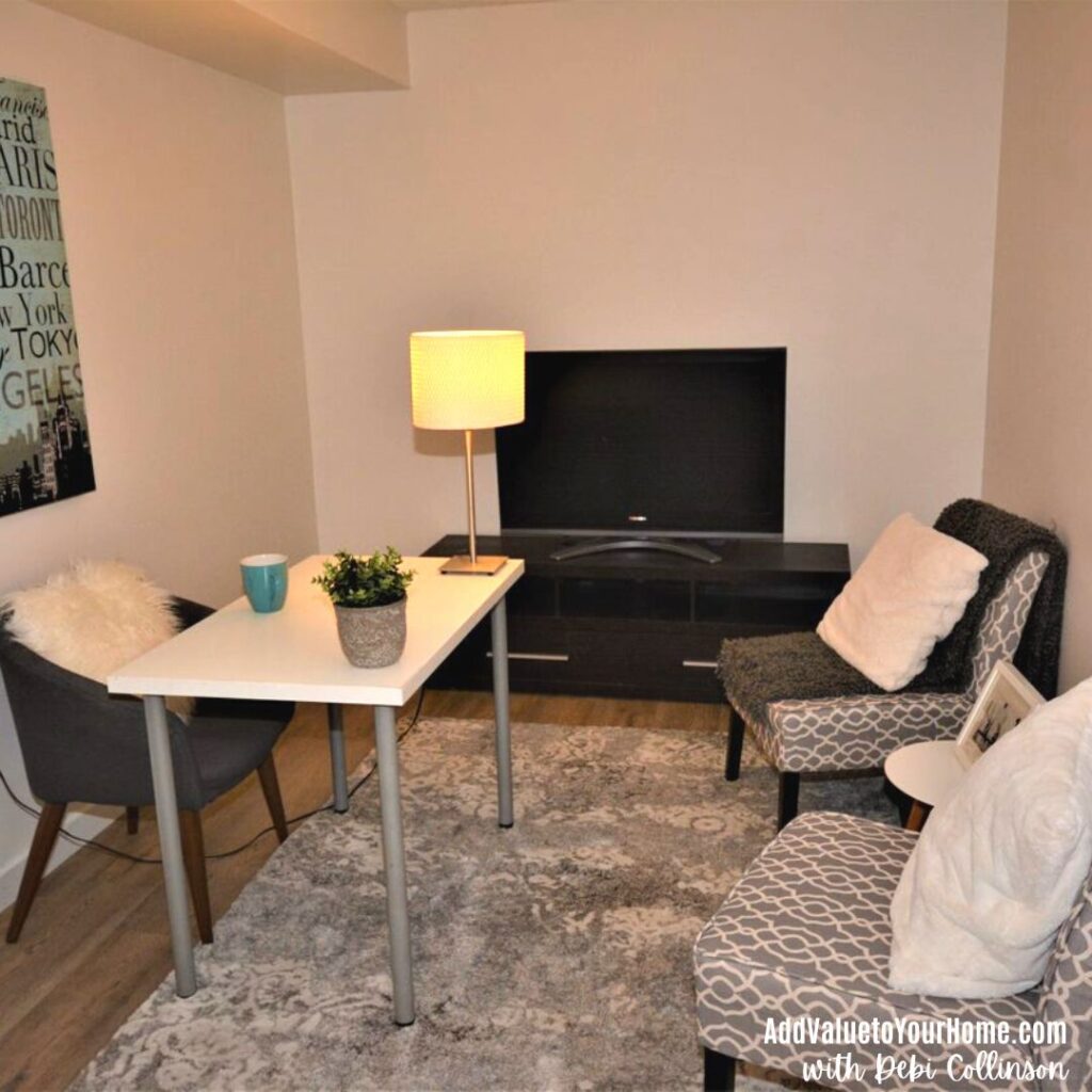
All three of the above pictures are from a townhouse I previously owned. They are all painted in the same color, Behr, Palais White which is VERY similar to Benjamin Moore White Dove. Its a warm white and is in the white paint color collection.
ALL these pictures were taken between 4 – 5 pm on the same day. The difference? The lighting and direction of the rooms. The living room is a north facing room so the light appears a bit cooler. The primary bedroom is south facing and gets a lovely warm glow of light throughout the day. The office was a former laundry room and has NO windows at all which makes it look a bit like primer because of the lack of light. In hindsight, I should have added a floor lamp to the office for more light.
- West-facing rooms are blessed with a flood of warm sunshine in the afternoons and early evenings where you can get your amazing sunsets.
- East-facing rooms get their burst of sun starting in the early morning and cools off during the day.
- North-facing rooms tend to have the coolest natural lighting of any space and are the trickiest to choose any paint color for.
- South-facing rooms have consistent filtered warm light.
So does north, south, east, west, or no windows matter when choosing a paint color? Yes it does have an impact it. The wrong color, like a cool white, in my north facing living room could have ended up looking like primer. You need to test your paint colors through a sample board, at different times of the day on all 4 walls to get a feel of how that color is going to look through all the lighting changes.
4. Undertones
You’ve probably heard about undertones. “Watch out for those undertones!” But what exactly is an undertone?
Mass tone vs. undertone. Whenever a color is made by mixing two or more colors together, the “mixed” color will have both a mass tone and an undertone. The mass tone is what you see first; it’s what tells you the color is red, blue, green etc. This is what you see on your wall. The closer the undertone is to the mass tone, the truer the color will appear. So a true red will have a mass tone and the undertone is similar. Magenta will have a blue undertone, while poppy will have an orange undertone. If the undertone is different from the mass undertone, you will see a “tinge” of green, yellow or another color for example.
Every color has an undertone except for pure white and pure black. They are the only exception. Black paint colors have undertones as do white undertones, and every other color in-between. Its the undertones that makes it so tricky to pick out the right paint color for your home.
Warm vs. Cool
How do you tell if a color is warm or cool? Warm colors create a cozy, warm vibe whereas cool colors are crisp and vibrant. Neither one is right or wrong. It just depends on the mood that you are wanting to create in your room.
Warm colors typically have a yellow, orange or red (pink) undertone.
Cool colors typically have green, blue or a purple undertone.
Can you mix warm & cool colors? Yes it is possible to mix warm & cool colors in certain. You can tone down a warm room by adding a cool color and warm up a cool room by adding a warm color. You need to do this with caution to ensure that the warm & cool colors don’t clash. In one of my client’s home, she had a warm honey oak kitchen cabinet & floors, warm beige carpet and steel gray walls. In my client’s case, the warm elements of the room where overpowered by the cool steel gray paint color. The correct color would have been a warm gray or a “greige” as we call warm grays, a tan or a cream for her walls.
5. Light Reflective Value – LRV
What the heck is LRV? If you have done any painting in the past trying to pick out paint colors from the thousands of paint chips that are available, you have probably noticed on the back of the paint chip, depending on the brand, the letters LRV with a number beside it.
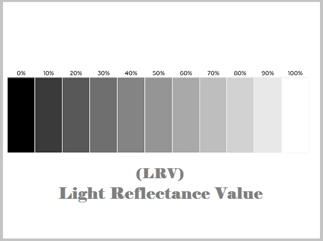
The LRV, which means light reflectance value, is a number assigned to a paint color on a scale from 0 being pure black to 100 being pure white, to indicate how light or dark a paint color is.
Everyone from architects and engineers to interior designers and color consultants uses LRV to predict how light or dark a color will appear in a room. The number can give you a quick guide of how light, dark or medium a color can be.
The following is a quick guide to what the LRV means for a paint color. Its a large range so obviously the lower the number means is closer to the category while the higher number will mean that its getting closer to the other category.
Quick guide to what LRV means for a paint color
0-40: Dark colors. Absorb more light than what’s reflected back.
40-60: Medium paint colors. They will reflect an average amount of light.
60-80: Light value. Light colors to off white colors.
80-100: High value. These are the white paint colors. They reflect a lot of light.
You also need lighting in the room to make a color come to life. Just because a color is light, if there isn’t enough light, the room can still look darkish or a bit dingy. Refer to my pictures of my townhouse above painted Benjamin Moore White Dove. The paint had the same LRV for each room, but three totally different looks due to lighting, and the direction that the room faces.
This is a very quick summary of LRV. It takes a while to understand the LRV of a paint color. But just know that if you’re not liking a color in your room, it could be because of how the light is reflecting or not reflecting off the walls.
6. Flow of the home
At an industry meeting of designers, one woman was boasting that she helped a client with a very large house, I think around 6 bedrooms, pick 28 colors for her home. Yikes!!! That’s far too many colors for a home. It would look like a checkerboard where every square inch was a different color.
In one of my design classes, our instructor taught us that, in theory, we should be able to take an upholstered chair and it should be able to look comfortable in the room. It doesn’t mean you need to actually do this, but its a good way to test the “flow” of your home. The exception for this “flow” test would be kids bedrooms, but its good to keep this in mind if you’re wanting to achieve a warm and cohesive look throughout your home.
Its fine to have more than one color in your home, but the colors need to complement and coordinate with each other so you don’t have hot pink in one room, orange next door etc etc. There needs to be some coordination and flow. This is where a color scheme using the color wheel comes into play so that your house looks “put together” so you don’t get a surprise every time you walk into a different room.
7. Don’t judge a paint color by its name!
Before you choose a paint color, there is one thing you need to know. Have you ever wondered how they come up with names for paint colors? They should have done a Seinfeld episode on this topic! lol. Seriously though!!!
There are a number of factors that go into coming up with these names, read more here but one thing you should know, that just because its called “white” “beige” “tan” etc, doesn’t mean its that color.
Just because a paint color is called white, beige or tan etc. doesn’t mean that its THAT color!
Here’s what I mean….
- Shoiji White is …. beige
- Indian White is …. beige
- Moderate White is …. beige
- Pure White is … not pure. It has a black of drop which gives it a gray undertone.
- Bennington Gray is … tan.
- Canvas Tan is … beige.
- Grant Beige is … tan.
- Bennington Gray is … beige.
- And so on and so on
I know, confusing right? If you use all the other methods listed here, and don’t get hung up by the names, you’ll be just fine. The bottom line is… don’t judge a paint color by its name!
8. Test test test! And compare!
Let’s face it, we’ve all probably at one point or another, chosen a paint color that we didn’t like once we started putting it on the walls. In some cases, we catch it early, change it and move on. But in other cases, we may have painted the walls, not absolutely love the color but lived with it anyways.
There is a better way to get the right paint color for your home. Long gone are the days were we pick a little paint color chip from our hardware store and hold it up against the wall. That is NOT going to help you get the right paint color. I repeat NOT!
The Best Way to Try Out Paint Colors
The old method of buying samples pots of paint and painting various walls is an inefficient way of testing the best paint color for your home. A better option is to buy large cardboard paint samples that you can actually test on your walls at different times of the day to access what is the best color for your home.
Samplize is a company that sells large paint boards from the leading paint companies and comes in a wide range of colors. These large paint boards can be placed with their sticky backing on various walls at different times of the day and in different rooms. It will give you a great way to see if the color works in your room or not.
Click here to check out & purchase samplize paint boards.
Feeling Overwhelmed? Need help?
I help busy homeowners, just like you, to style their house to make it a stunning retreat, where they can live and enjoy their home. I can help you come up with a design plan for a room taking all the guesswork and stress away from you and I can help you choose colors for your home or exterior that will co-ordinate with your existing features and give you a color that you will love.
Learn more about my online color, design & staging consults here.
Hi! I’m Debi Collinson. Designer. Color Consultant. Real Estate Investor.
I grew up looking at blue prints and helping my dad, an Engineer|General Contractor and owner of a Design|Build|Engineering firm pick out paint colors for his buildings.
In 2006, I staged my very first house. Staging was just starting to become known in the real estate industry. There was no formal staging training at that time so I watched every HGTV show on staging that I could find as I nervously staged my first house. The couple liked their newly “redesigned” home so much that they turned down an offer for full asking price and decided not to move. The rest, as they say, is history. I went back to school to study interior decorating and design. My design & staging firm is recognized for helping clients achieve their dreams either through designing their space, or helping them achieve top dollar by staging their home when they’re ready to sell.
In my spare time, LOL, I buy “fixer uppers” to fix up & either sell for a healthy profit or to rent. I’m currently looking for my 10th “fixer upper.” Sign up to receive my e-mails of how to make your home stunning, how to sell your house for top dollar AND how to become financially independent one fixer upper at a time! Read my full story including my design credentials here.
