7 Steps to Choose the right Exterior Paint Colors for Your House
When you’re driving down a street and are looking at the front exterior of the house, you’ll notice that some house exteriors really stand out in a positive way. They’re absolutely stunning! They look like they belong on the cover of House & Home. Whereas others looks boring, they’re basically all one color, and some are, can we say, down right ugly. Some house exteriors look so well put together while others look like a patchwork quilt. Choosing paint colors for your house is much more than choosing colors that you like and excluding colors that you don’t like.
How to Choose the best exterior paint colors for your house
1. Look at your stone & brick colors
There is a reason why some house exteriors are stunning, some are boring, and some look like a patchwork quilt. And that’s because some house exteriors are well planned and thought out whereas some, the colors chosen are more random. The method for choosing your paint colors for your exterior is similar to choosing your color scheme for your interior. You need to start with a plan. Just like when you’re designing a room, you start with an inspiration piece like a favorite piece of art, or a rug to pull the room together.
When you’re planning your exterior paint colors, you start the same way. You start with your inspiration piece and make a design plan. With exteriors, your inspiration piece is typically your stone and/or brick colors. You can pull colors from your stone/brick and use them throughout. If you don’t like the colors in your stone/brick, then use colors that complement them.
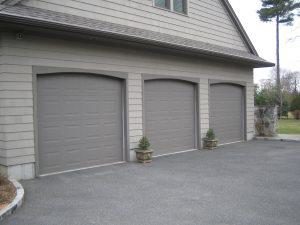
When deciding on your exterior paint colors, you need to come up with an overall design plan just like you would for planning your colors for a room in your house. You need to start with your inspiration piece which is typically your stone/brick or siding. Choose colors from it as your starting point or colors that would compliment your stone/brick. Typically your house should be 1 – 2 colors which includes the trim color. The garage door color should be one of these colors. Plus one more color for the front door if you want a front door to make a statement.
2. Determine the undertones of your stone, brick, windows, roof & driveway colors
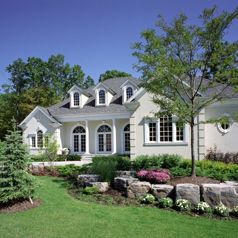
Just like house interiors, exterior paints have undertones as well. In our picture above, this house exterior paint color looks off because the undertones of the roof and the main body clash. The roof color is a pink-beige whereas the main body of the home is a light blue-gray. Also the white trim is the wrong trim color for the roof but suits the main body of the house. The cognac door works well with the roof color but is the wrong hue for the main body. The result is an off-balanced exterior finish that is actually devaluing their home.
What is an undertone you ask?
You’ve probably heard about undertones. “Watch out for those undertones!” But what exactly is an undertone?
Mass tone vs. undertone. Whenever a color is made by mixing two or more colors together, the “mixed” color will have both a mass tone and an undertone. The mass tone is what you see first; it’s what tells you the color is red, blue, green etc. This is what you see on your wall. The closer the undertone is to the mass tone, the truer the color will appear. So a true red will have a mass tone and the undertone is similar. Magenta will have a blue undertone, while poppy will have an orange undertone. If the undertone is different from the mass undertone, you will see a “tinge” of green, yellow or another color for example.
Warm vs. Cool
How do you tell if a color is warm or cool? Warm colors create a cozy, warm vibe whereas cool colors are crisp and vibrant. Neither one is right or wrong. It just depends on the mood that you are wanting to create in your room.
Warm colors typically have a yellow, orange or red (pink) undertone.
Cool colors typically have green, blue or a purple undertone.
Can you mix warm & cool colors? Yes it is possible to mix warm & cool colors in certain situations. You can tone down a warm room by adding a cool color and warm up a cool room by adding a warm color. But you need to do this with caution to ensure that the warm & cool colors don’t clash like they did in one of my client’s home who had a warm honey oak kitchen cabinet & floors, warm beige carpet and steel gray walls. In my client’s case, the warm elements of the room where overpowered by the cool steel gray paint color. Her painter recommended the paint color because it was trending at the time but the correct color would have been a warm gray or a “greige” as we call warm grays, a tan or a cream.
9 Neutral Undertones
Undertones fall into the following categories in no particular order:
- Orange-beige
- Yellow-beige
- Gold-beige
- Green-beige
- Green-gray
- Blue-gray
- Violet-gray
- Taupe
To figure out the undertones, put two color chips next to each other, and one will look more “green” and one will look more “pink”, or “cooler” or “warmer”, or “bluer” or “yellower”. If you can pin down your brick or stone’s undertone with a decent degree of confidence, it’ll help you make an educated decision on your paint color.
Exterior paint colors ALWAYS appear 2 – 3 times lighter on your brick than on the paint chip. You ALWAYS need to test your paint colors on your house BEFORE you have your house painted.
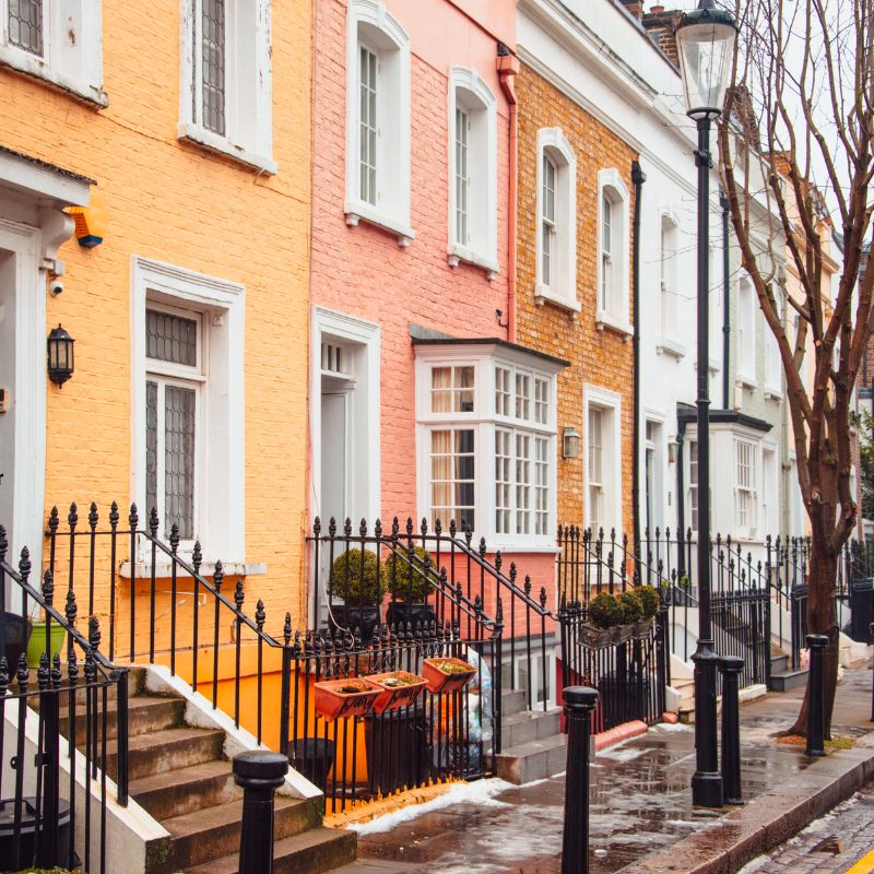
3. Your window color will have a big say in what your exterior colors are
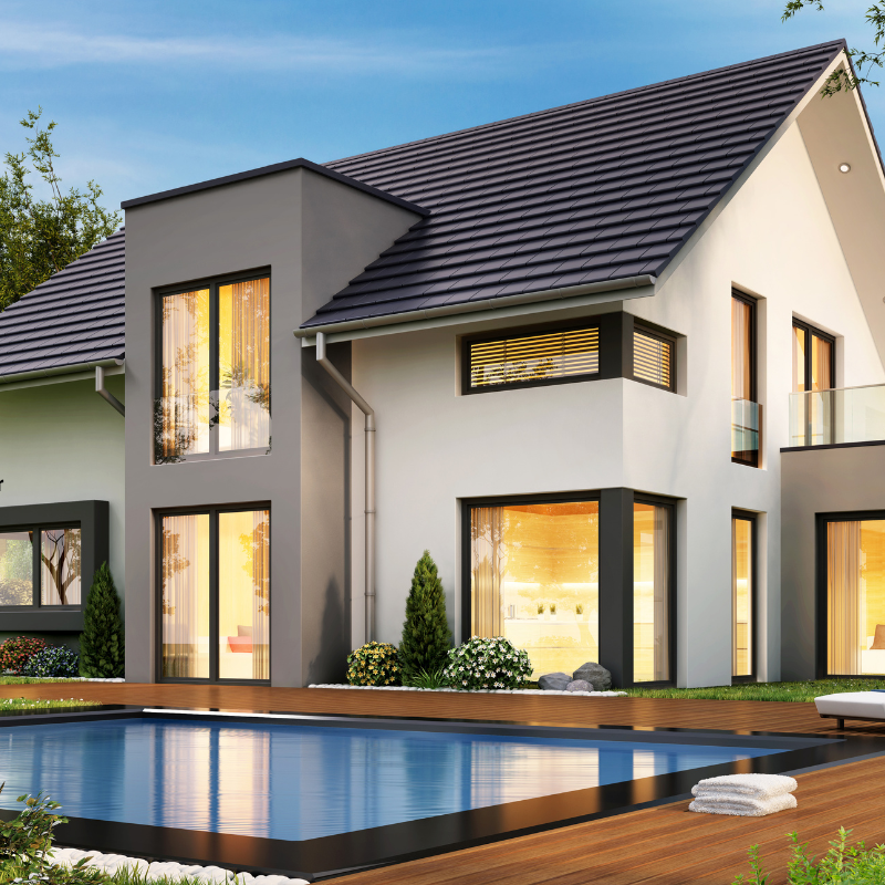
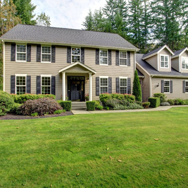
In our picture above, the homeowner has done an excellent job of keeping the colors to two colors while highlighting the black windows. Notice how the roof color coordinates with the window colors in addition to the coordinating pool trim as well.
The color of your windows will have a significant say in your exterior paint colors. Windows typically come in white, black, cream and tan. White is the most popular choice for windows, and its easy to see why. Its timeless and will not date.
Black windows are currently trendy & popular and look stunning on contemporary homes, but may not be the best fit for a very traditional house. Its dramatic and makes a powerful statement. But just because a window color is trendy or popular doesn’t mean its the right color for your home.
White windows work well with cool colors but look awful with natural warm earth colored stones. Creams and beige window trims work well with earth tone stones like beiges and taupes. Black windows can also look great with certain earth tone stones when choosing correctly.
4. Look at your roof & driveway colors
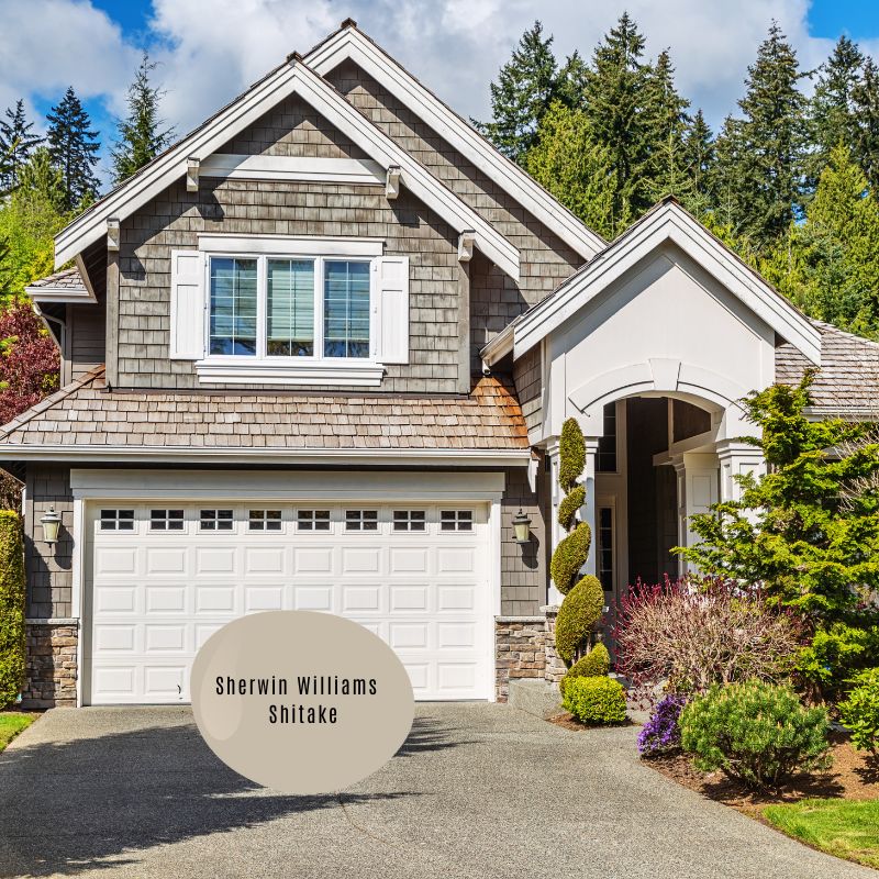
Roof and driveway colors also have an impact on the overall exterior paint colors.
The roof color in the above picture is very dominate. They have decided to use a lovely off-white as their accent colors. This house is beautifully done. The homeowners also could have picked another color for their garage door, Sherwin Williams Shitake is a perfect match, if they decided they want a more subtle color and not to draw attention to their garage door. But both colors work well. Its a matter of personal preference.
Read: How to pick the right roof color for your house
5. What is the Architectural Style of Your Home?
Just like there are interior design styles to define the style of a home’s interior, there are architectural styles that defines the style of your house’s exterior. There is a significant number of house styles out there, and it can feel overwhelming to understand what your own home’s style is, which ones are your favorites, and what qualities belong to each. Some styles are common, like Ranch, Cape Cod, Traditional, Colonial, Tudor, Craftsman, Farmhouse, Country, Cottage, Mediterranean, etc., but some you may not have heard of. Some styles are more prone to certain areas like the Cape Cod style is traditionally found on the east coast. But understanding your home’s style will help you figure out what may, or just as importantly, may not work for your home with its style. That doesn’t mean there is some creative leeway when designing an exterior color palette for your home, but your home’s style should give you some clues as to what direction you may or may not want to take for your exterior.
Read: 30 Popular House Styles & their Defining Characteristics
Look at what is going on in your neighborhood
Perhaps you’re planning a new build so you can start from scratch as to what colors you would like on your new build. Perhaps you are tired of how your house looks now, its dated and you want to start from scratch. You’re prepared to completely paint your entire but you’re not sure where to start. Take a drive around your neighborhood to get some ideas of what other houses have done, or not done. You don’t need to copy others on the street, but you definitely don’t want to be that sore thumb that people point to as the odd house sticking out. You want to be the house that people are pointing to and saying how beautiful your house looks.
When you plan on doing a complete exterior makeover, whether you’re starting from scratch with a new build, or repainting your existing house, its wise to go around your neighborhood and get a feel for what the designs and colors are acceptable in the area. That doesn’t mean by any means you have to be a copy cat or a conformist, but you don’t want to be the oddball either that sticks out in a negative way.
Does this feel overwhelming? Need some help?
Click here to check out my Exterior Paint Color e-design consult here
6. Finally, you can choose your trim, shutters, front & garage doors paint color
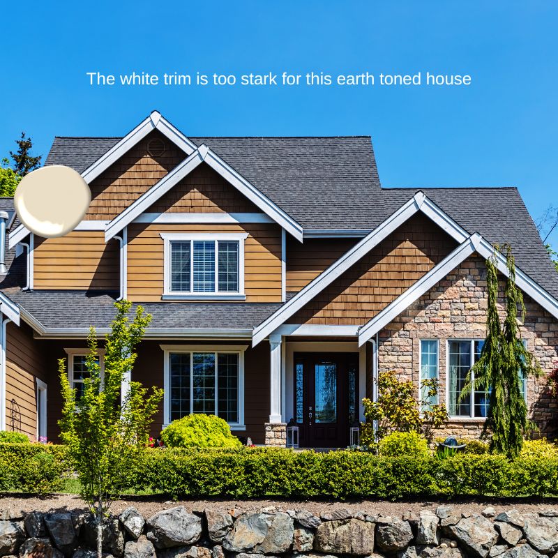
In our picture above, the homeowners did a great job of pulling out the colors from their stone for their roof and and siding color. Unfortunately, however, they stopped at the trim color and choose a stark white. A better choice would have been a warm earth toned or cream color.
Ironically, the trim color that can make or break the color scheme. Painting the trim the same color as the field can works in many cases and give the house the final touch, or in some cases, painting the trim color the same as the house can give the house an “unfinished” or “wedding cake” look. Darker trim – especially around the windows – can cause a “frame” effect, where the windows look like pictures hung on a wall. Keeping the trim lighter than the main body of the house is almost always a safe bet too.
Gutters, downspouts, and similar elements can be painted the trim color to help them “disappear” into the background if you don’t want your gutters & downspouts to stand out. In some cases, choosing one of the accent colors and having them stand out can also make the house look complete.
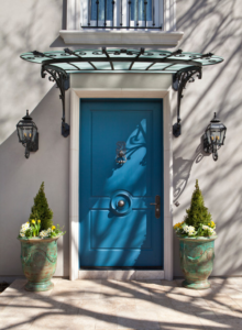
The front door, shutters, and the windows frames are good places for accent colors. Windows painted with accent and trim colors together can be the most interesting part of the composition.
The accent color is where the excitement is. Once you’ve chosen an attractive combination of body and trim, you can make it “pop” with an eye-catching accent color. Adding complementary and fun accent colors can give excitement to an otherwise muted color scheme and draws attention to the important features of the house.
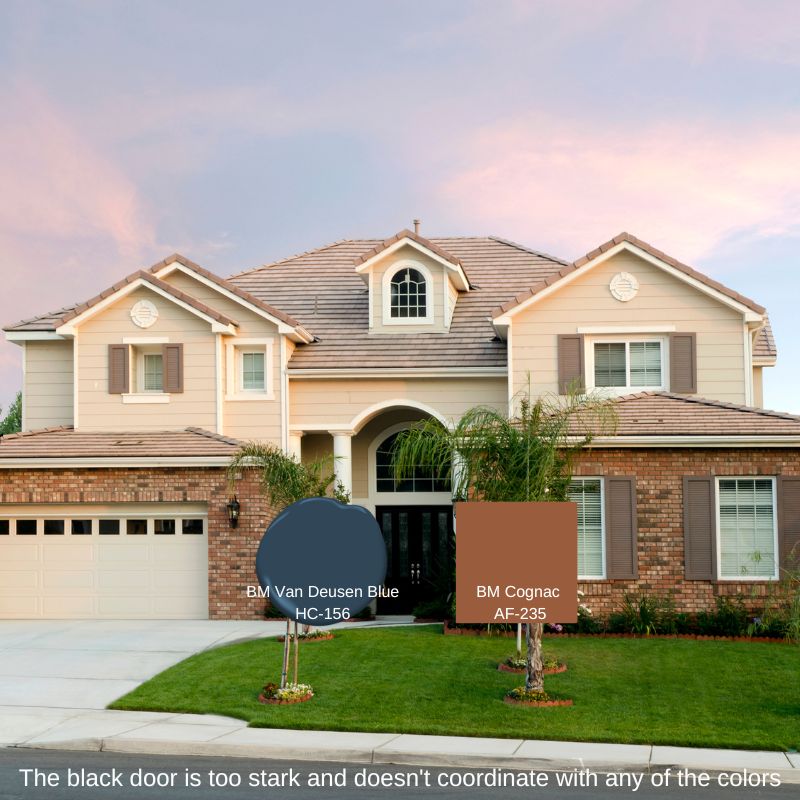
In the house in the picture above, the colors of the main body, trim and shutters are a perfect combination of colors that work together with their inspiration coming from the fixed elements, the brick colors. The homeowner or their designer, did an amazing job of choosing the right colors and the house looks amazing.
Where this palette could be tweaked is the door color. The black door is too stark and doesn’t fit in with the other colors. If they wanted to make a statement and use an accent color, a dark blue, like Benjamin Moore’s Van Deusen Blue or Hale Navy, or Sherwin Williams Naval would look awesome as blue and orange (brown) are opposite from one another on the color wheel and always make a great color combination together. If the homeowners wanted something a bit more muted, picking up one of the colors Benjamin Moore’s Cognac will also be a lovely choice.
Read: 6 Most Popular Paint Colors for your Front Door
Read: Top 5 Most Popular Garage Door Colors
Read: How to Choose an Exterior Trim Color for your House
Read: How to pick the Best Roof Color for your House
7. Create a Color Palette/Mood Board for Your Exterior
Many, many clients have come to me to “fix” their garage door color, or their trim color, roof color, or to help them choose a paint color to paint the brick. Sometimes its easy to recommend a paint color for a single element like a garage door color, or a roof, but 9 times out of 10, the challenge that the client is facing with their exterior, is that when you pick one color at a time, as you now see, one color can affect all the other colors on your exterior. Its a domino effect. If you have picked the correct colors from your stone/brick, you will not have a problem changing or choosing a different color if you’re tired of a color and want to change. However, if you don’t choose the right colors in the first place and your colors are off, switching up another color will prove challenging because the right combination of colors are dependent upon one another.
The best place to start is to create a mood board for your exterior in a software program like Canva or another similar one. Upload a picture of your current house and upload each of the fixtures of your exterior i.e. roof, siding, trim color, brick, garage door, front door etc. This way you can see all the colors together and see how you like them together or not. Put the paint color dots that you are thinking of around the appropriate areas to see if you like the colors against your fixed elements AND with each other. Once you have a combination you think you like, you need to test, test, test it!
Read: How to Create a Mood Board
Test, Test & Test Your Colors before Committing
Every color choice that you have chosen must be tried out on your house first before you paint your entire house. Paint on house exteriors will look 3 times brighter than they do on the chip. If you don’t test your paint colors, you could end up spending alot of money on painting and have to redo it over because you don’t like it.
Paints colors on house exteriors appear 3 times lighter than the paint chip. That’s why you always needs to test the paint color first before painting your entire house!
You can start testing paint colors with large sample boards. Put them in various spots on your house, with the most important being the front of the house. Once you narrow down to 1 – 2 colors, you will need to buy a quart of paint and actually paint large areas of your exterior to see if you like the colors are not. The larger the area you paint, the easier your choice will be!
Look at the color in sunlight and in shade, morning and evening. Wait several days before you choose. If you’re not sure of any of the colors, start again. Painting a house exterior is expensive and you don’t want to paint twice!
But painting your exterior with the right colors can make your house absolutely stunning and a show stopper for all those passing by! You can be the best looking house on your street!
Does this feel overwhelming to you? Need help?

Picking your exterior paint colors can be tricky.
You know your house exterior needs an update but you’re overwhelmed. You don’t know where to start. There are so many colors out there that its just overwhelming. Should you have one or two colors? Three? How do the colors go with your brick/windows/siding/front door.
My exterior paint color palette online consult can help you with that! Taking into consideration your personal preferences, the color of your front door, window trim, color of your brick/stone/siding, your answers to your questionnaire, your photos, phew!, that’s alot to consider, you will receive 2 – 3 specific paint color recommendations that would make your exterior Instagram worthy! I guarantee my work. I’m here to make sure you’re happy with your color choices.
Click here to learn more about my online e-design, & color consults.
Hi! I’m Debi Collinson. Designer. Color Consultant & Real Estate Investor.
I conducted my first color consult at the age of 7. lol I grew up learning how to read blue prints, going on construction sites and helping my dad, an Engineer|General Contractor|Co-Owner of a Design|Build|Engineering firm pick out paint colors for his buildings. Since 2006, I have been styling & staging hundreds of homes to make them look like they belong in a magazine page whether the client is styling to stay or staging to sell. Read my full story including my design credentials here.
Sign up to receive my e-mails on how to create a beautiful home you will love, how to increase the value in your home AND how to become financially independent one fixer upper at a time!