How to Create a Whole House Color Palette
Maybe you have just moved into a home that you’re not loving the existing colors or perhaps you’ve been in your house for awhile, but the house is just no longer working for you and its driving you crazy. Or you’re doing some renovations to the house and you want to update and refresh your current colors. Whatever the reason, you have decided to choose new colors for your home. That’s a great start but where do you start?
In my color theory class in design school, my professor said that “in theory”, you should be able to take an upholstered chair and walk through each room in your house and it should “belong.” Belonging means that the style and colors of the chair should feel that it fits or compliments the space. The chair should not feel out of place in the room. The exception is kids bedrooms. They can have full reign when designing their space.
But how do you this you ask? By creating a whole house color palette.
A whole house color palette sets the plan for your home. It helps you to create a cohesive look that will flow throughout your home, by choosing colors that complement your home’s current features and fixed elements, and most importantly, let’s you choose colors you love!
Color #1: Pick A Neutral for your Common Areas

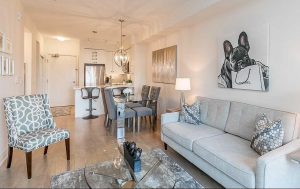
The first color you should choose when picking a whole house color palette is to pick your neutral. A neutral is the color that will run throughout your house. If you have an open concept home, where the hallway, foyer, family room and kitchen for example are open with no distinct wall separation, you will want to pick a color that you love and complements your fixed elements, and your existing furniture and accessories. If your open hallway extends to upstairs, you will want to continue this neutral to the upstairs hallway as well.
How to Pick a Neutral for your Common Spaces
There are so many neutrals out there is can be overwhelming to pick the ONE perfect neutral for your home. How do you start?
The first place to start is to look at your fixed elements in your home. If you have an open concept home where the kitchen is part of this space concept, this will be the place where you want to start. When deciding on your neutrals, you want to make sure that your neutrals co-ordinate with your fixed elements like kitchen cabinets, backsplashes, countertops and flooring. These fixed elements are the most expensive features in your home so you want your main color to co-ordinate with these elements for a cohesive flow. Otherwise, your house can feel off.
If your kitchen is behind closed doors and not part of the open concept space, then that will give you more options with your neutral color choice if you want a different color for your kitchen. If you do want the same neutral for your walls, then you should start choosing your main neutral in the kitchen.
For this example, we are going to choose a whole house paint color starting with our kitchen because the kitchen is part of the open concept design.
Whether you’re doing a kitchen renovation or you are picking a color for your existing kitchen, you need to look at the colors and undertones of your fixed elements. It helps to have a white piece of paper under your fixed elements to see the true undertones.
Specifically here, we are looking at the kitchen cabinets, backsplash, countertop, and flooring.

Photo: Sherwin Williams
For this example here, we are going to choose Sherwin Williams Alabaster SW008. In our picture above, Sherwin Williams used Alabaster for both the kitchen cabinets and the walls. If you have an open concept area where the kitchen is part of the open space, you could paint the walls in Alabaster and paint the cabinets in another color. That would look beautiful as well.
Sherwin Williams Alabaster SW 7008 is one of Sherwin Williams most popular warm whites and was named Color of the Year 2016. This paint color is one of Joanna Gaine’s favorite paint color and its easy to see why. Its a warm white with a slight yellow undertone. Its great for those north facing rooms and its great as a whole house paint color. You can paint your whole house on the walls using this color and the trim, doors & ceiling in a different sheen. Its also a great color if you’re looking for a white for trim, doors & ceiling and your walls are a totally different color. This color is considered to be “similar” to Benjamin Moore’s White Dove.
We’re going through a phase in the design world where homeowners are picking darker neutrals. We’re moving away from the lighter neutrals for our main color. There is absolutely nothing wrong with a darker neutral as long as it fits your interior design style, your fixed elements of your home, and you’ve tested it to be sure that you want a dark netural.
If you’re confused by all the different neutrals, white, off-white, cream, taupes, greiges, beiges and tans, you’re not alone! Trust me! I have helped many clients in my online color consulting business to pick the right color for their home the first time around!
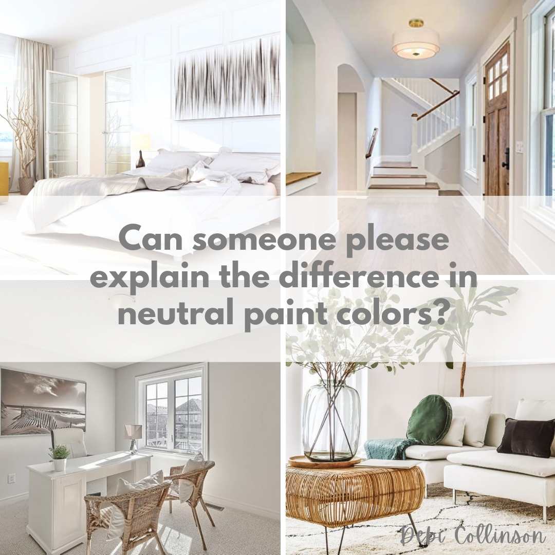
Need some help understanding the difference between neutral paints colors?
Sign up HERE to receive my FREE email series where every day for 7 days you will receive a new neutral paint color tip!
Color #2: Pick a White for Your Trim, Doors & Ceilings
At the risk of totally confusing you, you can use some whole house neutral paint colors for your trim, doors & ceilings using a different sheen than your wall color sheen. However, it works depending on the neutral you pick for your common areas. Sherwin Williams Alabaster is one of the colors that you can pick for your whole house including your trim, doors & ceilings, but for this example we’re going to pick another “white.”

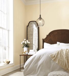
For one of my recent house flips, I painted my whole house Benjamin Moore White Dove (often compared to Sherwin Williams Alabaster.) But I used a “white” Benjamin Moore Chantilly Lace (often compared to Sherwin Williams High Reflective White) for my trim, doors & ceiling. Personally, I like the distinction between the wall paint color and the trim, doors & ceiling. Can you see the difference in the primary bedroom on the right? Its subtle but I personally like it. Its a matter of personal preference.

For our house example here, we are going to choose Sherwin William’s Pure White 7005. This versatile, bright white has the slightest yellow undertone that keeps it from appearing too stark. Use on trim for the perfect complement.
Normally I would not recommend Sherwin William’s Pure White for doors, trim and ceilings randomly because of its slight yellow undertones. There are other whites that would work better for some neutrals.
But since Alabaster has slight yellow undertones, its a match made in heaven. Both colors are warm whites and with Pure White being a tiny bit lighter than Alabaster, it will make a nice distinction.
Need more help picking the perfect trim color for your home?
Read: Best White Trim, Doors & Ceiling Paint Colors
Picking Colors for Secondary Living Spaces
Now that we have the two most important colors chosen, we can pick the secondary colors for the living spaces. These spaces are rooms that are not part of the open spaces and are typically separated by doors or are off the rest of the common area like alot of dining rooms for example. Separate spaces include bedrooms, bathrooms and offices. They can also include kitchens, dining rooms and living rooms if they have a separate entrance from the main common area.
Color #3: Pick a Deeper Neutral
To make a distinction from your lighter neutrals, you likely want a darker neutral from your common neutral color you picked, to give you some variety in your choices in the secondary rooms.

There are several ways to pick a deeper version of our common neutral color. One way of course, is too take ques from your fixed elements, furniture and accessories that already exist in the room that we discussed earlier in our kitchen example.
Another way we can pick a neutral is to go the paint company’s website, type the neutral you have chosen and look at the “strip” of neutrals that they offer.

For our common areas we chose Sherwin Williams Alabaster as our common space neutral. As we see in the picture above, Sherwin Williams suggests other neutrals at the top for darker neutrals of similar color. We’re going to choose SW 7634 Pediment because its the perfect color to differentiate from Alabaster. It has an LRV of 51 which makes it a medium toned color. Its a deeper shade from Alabaster without be too gray, pink or other undertones that we don’t want to introduce. It gives us another option from Alabaster without making making our house look like a checkboard by picking too many bold colors either.
Read: What LRV means in paint colors and why it matters!
Picking Colors for Secondary Rooms
Phew! We got the hard part out of the way picking the neutrals! Now for the fun colors! These are the colors for your secondary rooms like the bedrooms, bathrooms, and your dining room, living room and/or office if they are not in the common area.
Where to start when picking colors?
It may seem daunting to pick colors randomly and I could go on and on about how to use color theory, but there are two tips to consider when choosing your secondary colors. What colors are you already using in your fixed elements and what colors do you love.
1. What colors are you already committed to?
As we discussed when picking out a neutral for the kitchen, the same rule applies when choosing color for your other spaces. Take a look at your fixed element like cabinets, flooring and perhaps larger furniture & cabinets that will be staying. These colors will help guide you if they are staying in your home.
2. What colors do you love?
There are colors that you are likely using in your home that you already love. Look at your furniture, accessories, artwork etc. Take ques from colors that you already love in your home whether it be through a rug, stunning artwork, accent furniture etc.
Color #4: Color for Bedrooms or Bathrooms

Colors like blues & greens are very relaxing and great for bedrooms and bathrooms.
For color #4, we are picking Sherwin Williams Upward SW6329. Upward is Sherwin Williams Color of the Year for 2024 and its easy to see why it was picked. Sherwin Williams calls this color “denim blue with calm gray undertones.” Its a very calming and serene color that is perfect for a family bathroom, ensuite, powder room and bedrooms as well.

Photo: Sherwin Williams
This bathroom above is lovely, its very calm with its double vanity painted in Sherwin Williams Upward complimented by the matching interior door also in Sherwin Williams Upward.

Upward also looks beautiful and calm in this primary bedroom. Serene calm colors are perfect for guest bedrooms, kids bedrooms, nurseries and bathrooms.
Read: Sherwin Williams Upward Paint Color Review
Color #5: Color for Bedrooms or Bathrooms

For Color #5, we are picking another beautiful soothing color that is perfect for bedrooms and bathrooms. Sherwin Williams Rainwashed 6211 is a beautiful green-blue shade of paint that we see below being used in an ensuite bathroom and a bedroom.


Photo Left: Sherwin Williams Photo right: @housetohomediy
Sherwin Williams Rainwashed looks gorgeous in both of our photos above. The ensuite bathroom (left) is very inviting and serene in the gorgeous blue-green. The bedroom (right) is equally as inviting and calming.
Color #6: Color for Bedrooms, Bathrooms, Guest Bedrooms

Blush is having a moment right now and its easy to see why. For our color #6, I am choosing Sherwin Williams Malted Milk 6057. Its a warm reddish shade that will make any room inviting.

This beautiful shade of red | pink would look awesome in a guest bedroom, a girl’s bedroom or an office. Sherwin Williams also suggests that this color would be suitable for a dining room if you dare.

Photos above: Sherwin Williams
You can see in these photos above, how beautiful and warm SW Malted Milk is. A guest bedroom or girl’s room is a logical choice for Malted Milk. Using Malted Milk for a gorgeous bathroom may be too bold for most, but isn’t it gorgeous? Take note of the warm neutrals that are also used in the rooms using the other neutrals from our whole house color palette.
Color #7: Pick a Warm Dramatic Color for Your Living Room, Office or Dining Room Color

Keeping with our calm, serene color scheme, I’m choosing Sherwin Williams Color of the Year 2022 Evergreen Fog 9130. A gorgeous green, with gray undertones, and a touch of blue. This color fits well with the blues, greens and neutrals that we have already chosen for our whole house.
This color is gorgeous and you can use it in an entire room or as an accent wall if you want just a touch of drama.

Photo: Sherwin Williams
Personally, I love a warm bold color for a dining room. Its fun to have a little drama when you’re sharing a meal with family and friends. If you have a separate room for your dining room and its not in a common area, try this wonderful color in your home.

Photo: Sherwin Williams
Evergreen Fog would also look warm and cozy in an office.

Photo: Sherwin Williams
Not sure you want a whole room with this deep warm color like Evergreen Fog, try an accent wall like this gorgeous guest bedroom above.
Color #8: Pick Your Accent Color

Now the last color to pick for our whole house color palette is a bold accent color. You can use this color a little or alot throughout your home depending on your style, and your comfort level for bold darker colors.
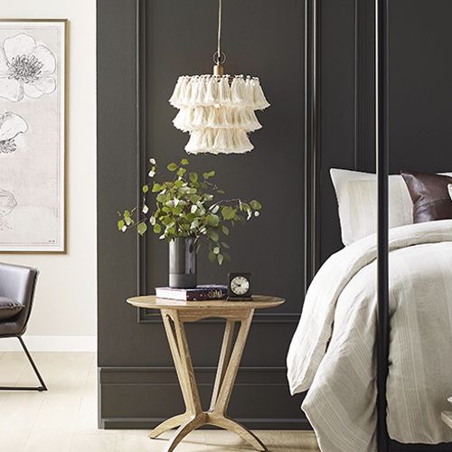
For our last color, I have chosen Sherwin Williams’s Color of the Year 2021 Urban Bronze 7048. Its a beautiful deep brown with gray undertones. Its a warm rich color and will go beautifully with the other colors in our color palette. Sherwin Williams shocked the design world in 2021 when they named this color their Color of the Year 2021.
But since 2021, we have seen Urban Bronze increase in popularity among homeowners and used in many different ways. But however it is used, it definitely makes a bold statement. You can use it as an accent wall for a bedroom, office or dining room, or you can use it in an entire room if you’re brave enough.

Both photos above: Sherwin Williams
I’m loving this bold color for a dining room. It creates a fun and intimate setting where you share dinner with family and friends. If a bold color like Sherwin Williams Urban Bronze is too much, try one of the calm relaxing secondary colors that we choose, or use the color as an accent wall.
What something even more bolder than Sherwin Williams Urban Bronze? Try Benjamin Moore’s Color of the Year 2026, Silhouette
Read: Benjamin Moore’s Color of the Year 2026 Silhouette
How many colors should be in a color palette for a house?
I was speaking to another designer at a design event who was bragging sharing how she just picked 26 colors for an ENITRE house! HOLY COW! Was my insight thoughts. It was a big house, apparently, but it was going to look like a patchwork quilt.
You should have 4 – 8 colors in your color palette. Its your personal preference if you want to select a few colors and use them throughout your house, or use the 8 as shown in various samples above.

How to Incorporate Your Color Palette Throughout Your Home
Now that you have created a whole house color palette? Now what?? Hopefully by now, you have some ideas of what rooms you want to use which colors.
Depending on where you are in your decorating process, you want to go through each room and come up with a design plan. Start on the most urgent rooms first that are driving you crazy or are hindering the function of your home.
I highly recommend creating a vision design or mood board for each space with your color palette in mind. Look at the furniture & accessories you are keeping and what you want to purchase to complete your look. When deciding upon your room’s features, incorporate some of the other colors from the palette in cushions, a rug, wall art for example.
Don’t rush this process!!! Take your time and figure it out. Test your colors with test pot paint before committing to the entire room.
Read: Why You Need to Create a Mood Board for your room design
Read: How to create a Focal Point in a room
Coming back to our Sherwin Williams Upward bathroom example, there are many ways to incorporate some of the colors of our whole house color palette. For the runner, you could use a rug with Malted Milk tones in it. Or the artwork could have three colors of the palette.
For our bedroom example above, there are many ways to incorporate the colors from our whole house color scheme. Red is the opposite of green on the color wheel and thus are complimentary colors. You can use SW Malted Milk in a throw cushion, bedding or a painting. Or you can incorporate the blues & greens in the bedding, cushions or a rug. Styling a room is where the fun part begins of a room design. Its where you put your own personality in a room.
Using your whole house color palette in various ways in the rooms is how you create a flow throughout your home. That doesn’t mean you want every single color in every single room, but incorporating a few colors in each room creates a cohesive home.
Read: 5 mistakes homeowners make with their furniture
Is this overwhelming? Need help?
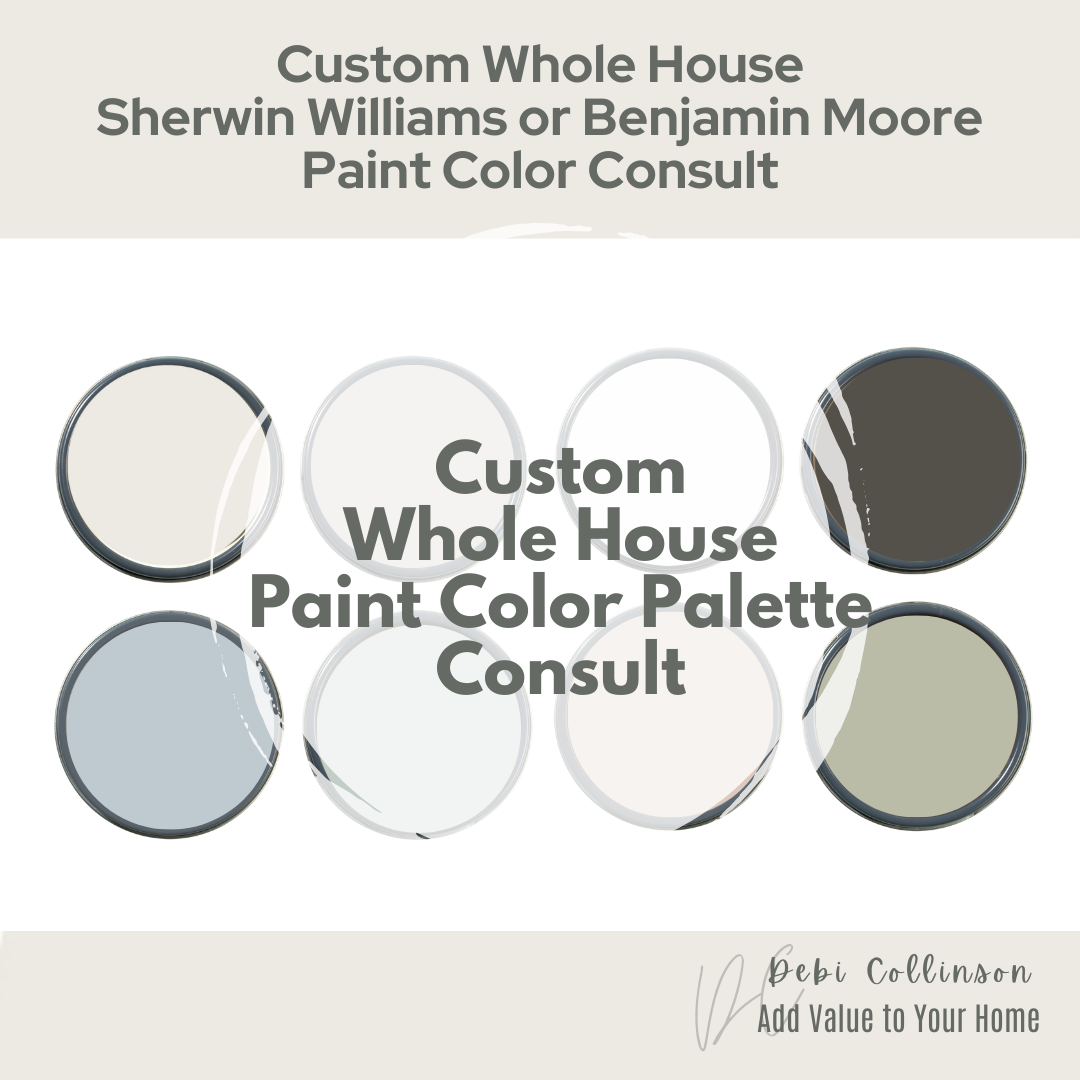
It can be but I can help you take the overwhelm off you with my Whole House Paint Color Palette.
After receiving payment, your pictures and your thoughts, desires and plans from your questionnaire, I will develop a whole house paint color palate.
You will receive colors from you preferred paint color company, detailed instructions including real life pictures of how and where to use these colors. This product is digital PDF product. Click here to learn more.
Check out my Custom Whole House Color Palette here
I help busy homeowners, just like you, to style their house to make it a stunning retreat, where they can live and enjoy their home.
Hi! I’m Debi Collinson. Designer. Color Consultant & Real Estate Investor.
I conducted my first color consult at the age of 7 lol for my dad. I grew up looking at blue prints, going on construction sites and helping my dad, an Engineer|General Contractor and Co-Owner of a Design|Build|Engineering firm pick out paint colors for his buildings. Since 2006, I have been helping hundreds of clients to homes to make them look like they belong in a magazine page whether the client is styling to stay or staging to sell.
In my spare time, LOL, I buy “fixer uppers” to fix up & either sell for a healthy profit or to rent. I’m currently looking for my 10th “fixer upper.” Sign up to receive my e-mails of how to make your home stunning, how to pick the best colors for your home, and how to add value to your home all at the same time! Check out my full bio including credentials here.